Call 571-895-2770
70 Call-To-Actions Examples so Good, You Can't Resist Clicking
We have all heard the same Call-To-Action definition over and over again at this point. It is usually something along the lines of "A call to action (CTA) is a directive or instruction to the reader to do something" or "A call to action (CTA) is an essential part of any online marketing strategy". But what does that really mean for your business? And how can you create a good CTA that will actually work?
To help you out, we have put together a list of 70 call-to-action examples that are so good, you just can't resist clicking on them!
You can jump ahead to the examples by clicking the links below. However, if you want to learn more about what makes a good CTA before checking out the examples, keep reading!
What is a Website CTA?
By definition, a CTA is "a directive or instruction to the reader to do something". In other words, it is a way to encourage your readers to take action.
Typically, CTAs are used in digital marketing and advertising to prompt an immediate response from the reader. For example, you might see a CTA that says "Click here to learn more about our website design services" or "Download our free Digital marketing e-book".
The goal of a CTA is to get the reader to do something, whether that is to make a purchase, sign up for a newsletter, or download a piece of content.
But we already know that don't we?
Think about it this way, if your website's goal is to generate leads, then a CTA would be any line of text, button, or image that encourages a user to provide their contact information so that you can follow up with them.
Therefore, a CTA is more than just the directive we use to drive the user experience on our website. The concept of CTA extends to the attention-grabbing section where the actual instructive words are (usually an image, button, or short line of text), as well as the larger context in which it sits.
In short, anything that encourages your audience to take action is considered a CTA.
Now that we know what a CTA is, let's take a look at what makes a good CTA.
What Makes an Effective Call-To-Action?
There are multiple factors that contribute to whether or not your CTA will be successful.
The first thing you need to consider is your audience. What are their needs and wants? What would prompt them to take action?
Your CTA needs to be relevant to their interests and needs in order to be effective.
In addition, your CTA copy should be clear and concise. The reader should know exactly what they need to do and what they will get in return. Be sure to include strong action verbs such as:
- Download
- Learn more
- Sign up
- Buy now
- Claim your free trial
- Get started
For example, if you are targeting parents of small children, then a CTA that says "Download our free guide to potty training" would be more effective than a CTA that says "Sign up for our newsletter".
You also need to consider the context in which your CTA will appear. For example, if you are including a CTA on your website's homepage, then you have a lot more real estate to work with than if you are including a CTA in an email blast.
In the case of an email blast, you might want to consider using a more action-oriented CTA such as "Download Now" or "Buy Now".
Finally, you must ensure that your CTA is visible and clear. The last thing you want is for your audience to miss your CTA altogether because it was buried at the bottom of a long page or hidden in small font size.
What is the best place to add a Call-To-Action on my website?
There are a few general rules you can follow when it comes to the placement of your CTA. We have made a list of the most important considerations to keep in mind.
1. Above the fold: This is the most coveted spot for any CTA because it is the first thing that users will see when they land on your page. If you can manage to place your CTA above the fold, then you are more likely to get users to take action.
2. In the middle of the page: Placing your CTA in the middle of the page is also a good option because it will be visible to users as they scroll down.
3. Below the fold: If you cannot place your CTA above or in the middle of the page, then the next best option is to place it below the fold. Just be sure that it is still visible and clear so that users don't miss it.
4. In the sidebars: Sidebars are a great place to include CTAs because they are always visible, no matter where users are on your page.
5. In the header or footer: The header and footer are also good spots for CTAs because they are always visible on every page of your website.
6. In pop-ups: Pop-ups can be effective, but use them sparingly as they can be annoying to users. If you do use pop-ups, be sure to make the pop-up trigger when specific actions are met by the visitor. For example, you can make the pop-up appear after the user has been on your page for a certain amount of time or when they are about to leave your page.
7. In the content: Last but not least, you can also include CTAs in the body of your content, such as in blog posts or articles. Just be sure to make them relevant to the topic at hand so that they are not out of place.
Now that we've covered the basics of what makes a good CTA and where to place it, let's take a look at some specific examples.
70 irresistible Call-To-Action examples and why do they work
We wanted to give you a comprehensive list of amazing CTA examples. We gathered 70 examples of effective call-to-action phrases and buttons to help inspire your own.
We divided the list into different categories for easy navigation. You can click any of the links below to learn more about the category of your choosing. You'll find CTAs for:
- Websites, Blogs, and Landing Pages CTAs
- E-commerce CTAs
- Pop-Up CTAs
- Another 10 great eCommerce CTA examples
- 10 Call To Action Examples with Great Persuasive Speech
Websites, Blogs, and Landing Pages CTAs Examples
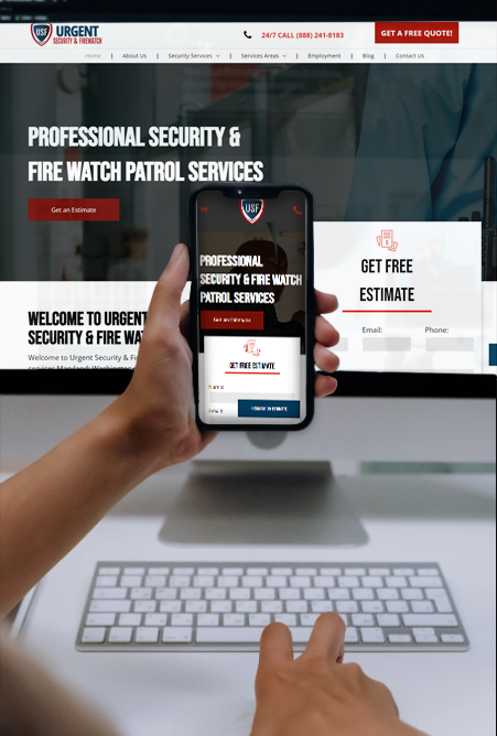
1. We Apply Pressure
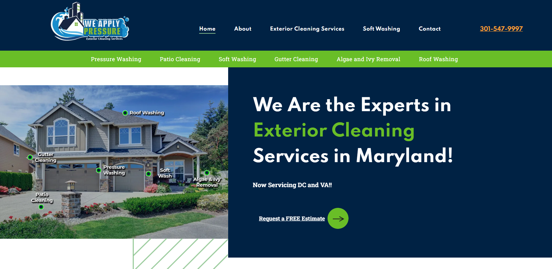
This is a fantastic example of an above-the-fold CTA. It gives the user a quick rundown of the services this firm provides and concise, direct instructions on what to do next.
Another noteworthy element from this example is the striking contrast between the bright colors and dark backgrounds. This not only makes the CTA more visible to users but also increases its click-through rate.
2. Image Flooring Kitchen & Bath
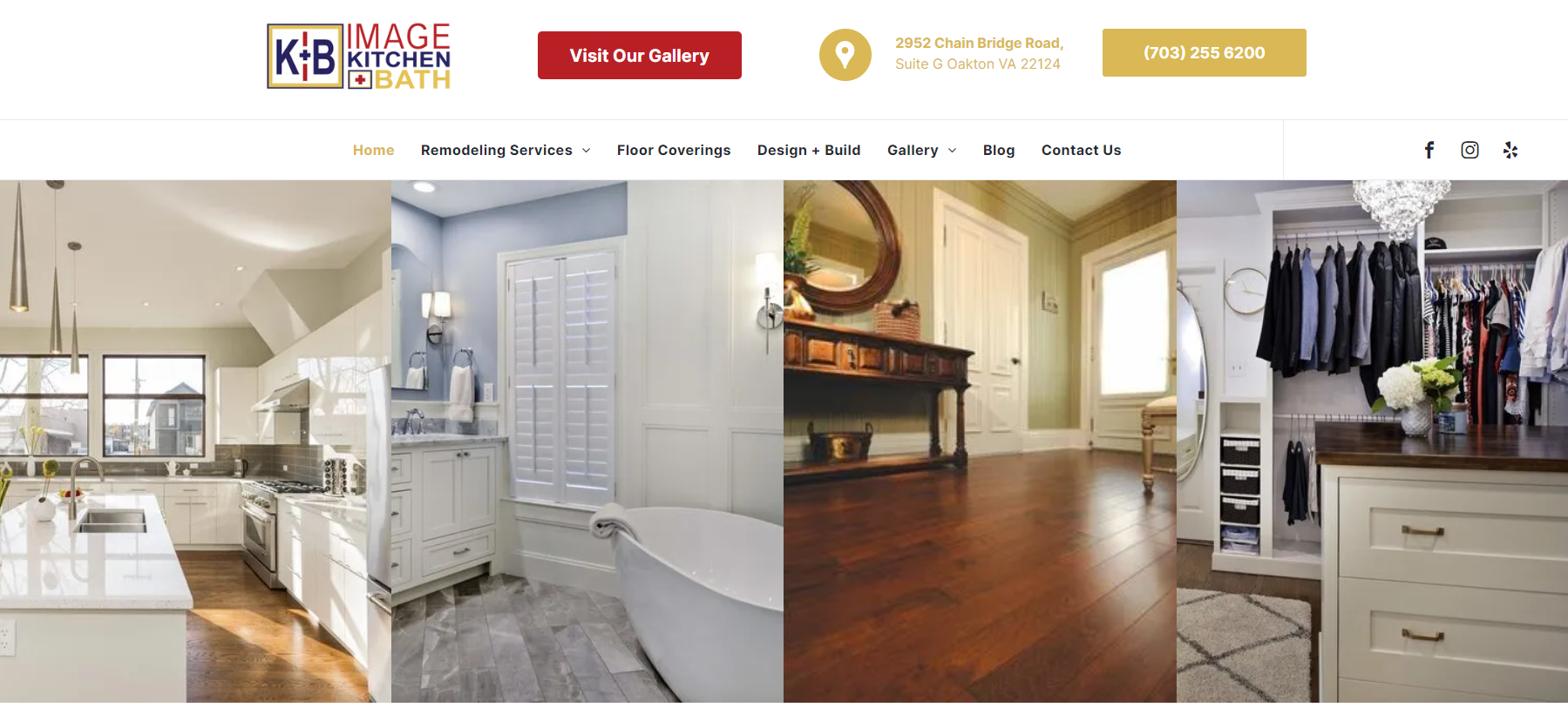
This home renovation company focuses on style. The whole website's look and feel speak volumes of the quality of their work. The same applies to the strategy behind their header CTA. The main focus of this CTA is to
drive traffic toward their gallery page. This page is filled with images of previous completed projects and acts as a powerful conversion tool.
3. Tours at Your Service
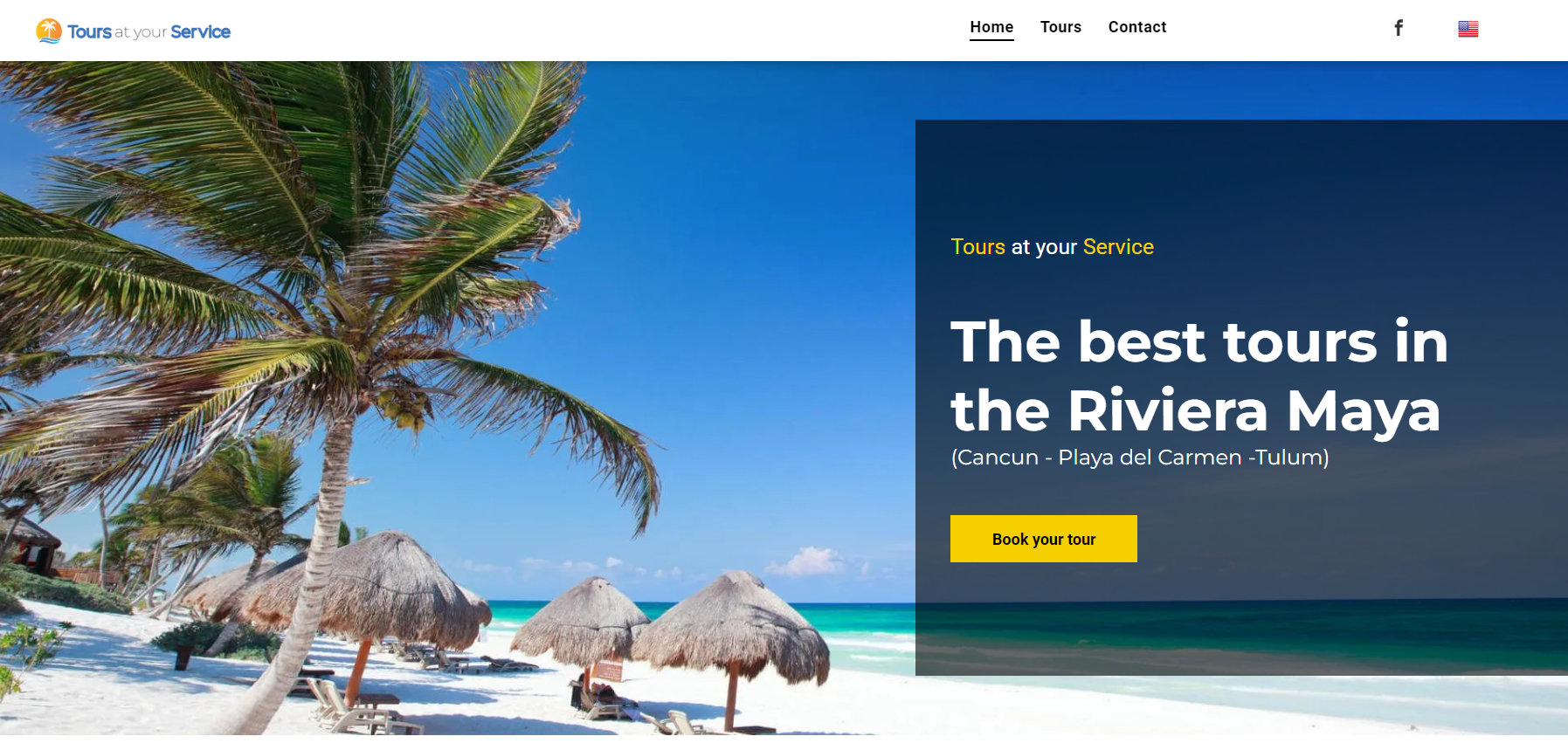
This Mexican tour provider knows the value of a strong CTA. Their website's hero section features a clear and concise call-to-action that tells the user exactly what they need to do. The use of first-person (Book your tour) also helps to create a more personal connection with the user.
The use of strong wording, combined with attention-grabbing images and colors drives the user's attention toward their CTA.
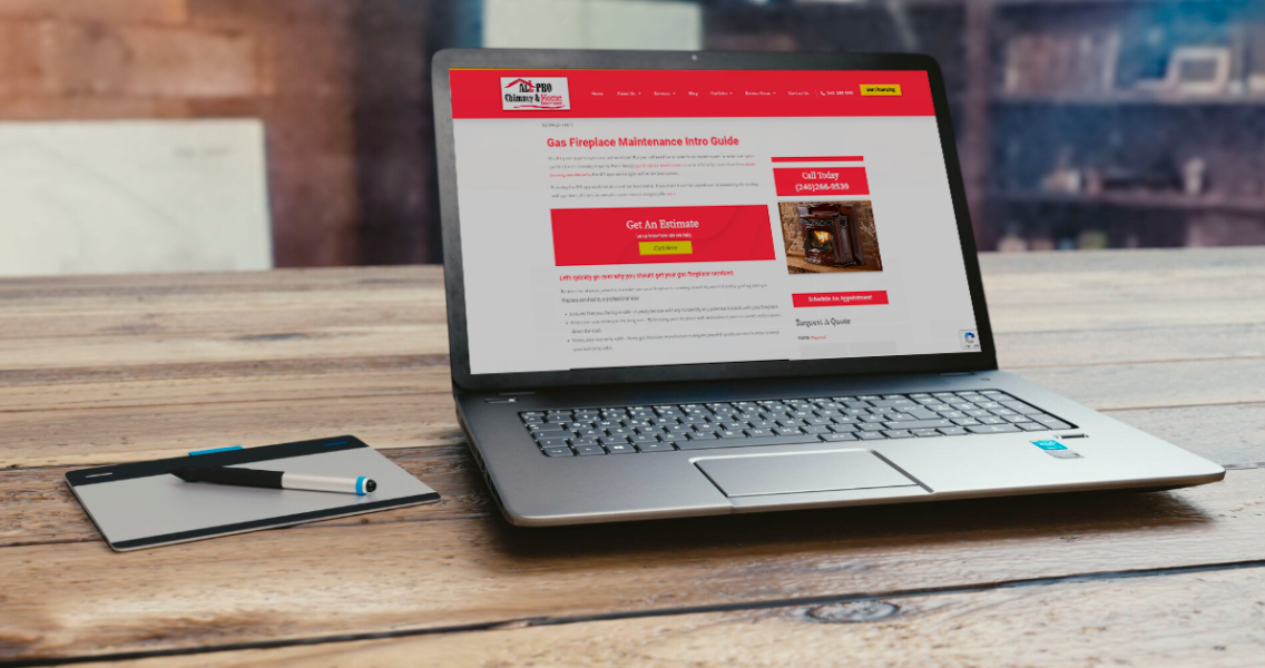
4. All Pro Chimney & Home Improvement
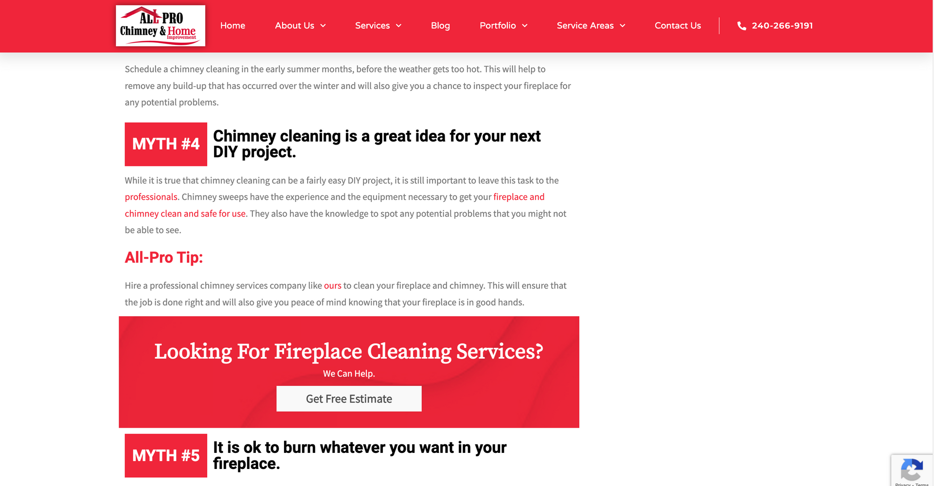
Here is a great example of a brilliant CTA placed on a blog from a chimney service company in Maryland. I thought it was rather clever how they integrated this call to action into the same section that discusses why chimney cleaning as a do-it-yourself project is not the best idea.
In other words, they first explain why you should always hire professional help for this type of project and then tie it all together with a CTA that allows the user to book their services online. This is a great way to increase conversions as it provides the user with a direct and easy way to take action.
On top of that, the use of bright red on top of the page's white background makes this Call-To-Action stand out from the rest of the content.
5. Nearshore Direct Staffing
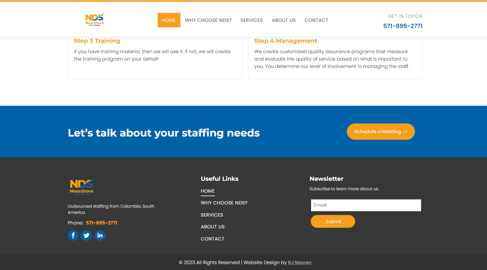
Footers are a great place to add a CTA. This helps to ensure that users will see it no matter where they are on your website.
This staffing company based in Colombia uses a simple but effective CTA on its website's footer. The use of first-person (Let's Talk) makes the CTA more personal and inviting. The actual instruction (Schedule a Meeting) is clear and lets the user understand beforehand what is the next step in the process.
6. Oasis of Hope

Remember when we mentioned that is very important to keep your audience in mind when creating a new CTA? well, this is a great example of that. A big part of what they do is listen to their user's problems and then offer real solutions. So, it only makes sense that their CTA would revolve around that idea.
The CTA on their website's header is a great way to engage with users and get them to take action. The instructive wording "Talk to Us" is a great way to convey the company's main message which is to provide support and guidance.
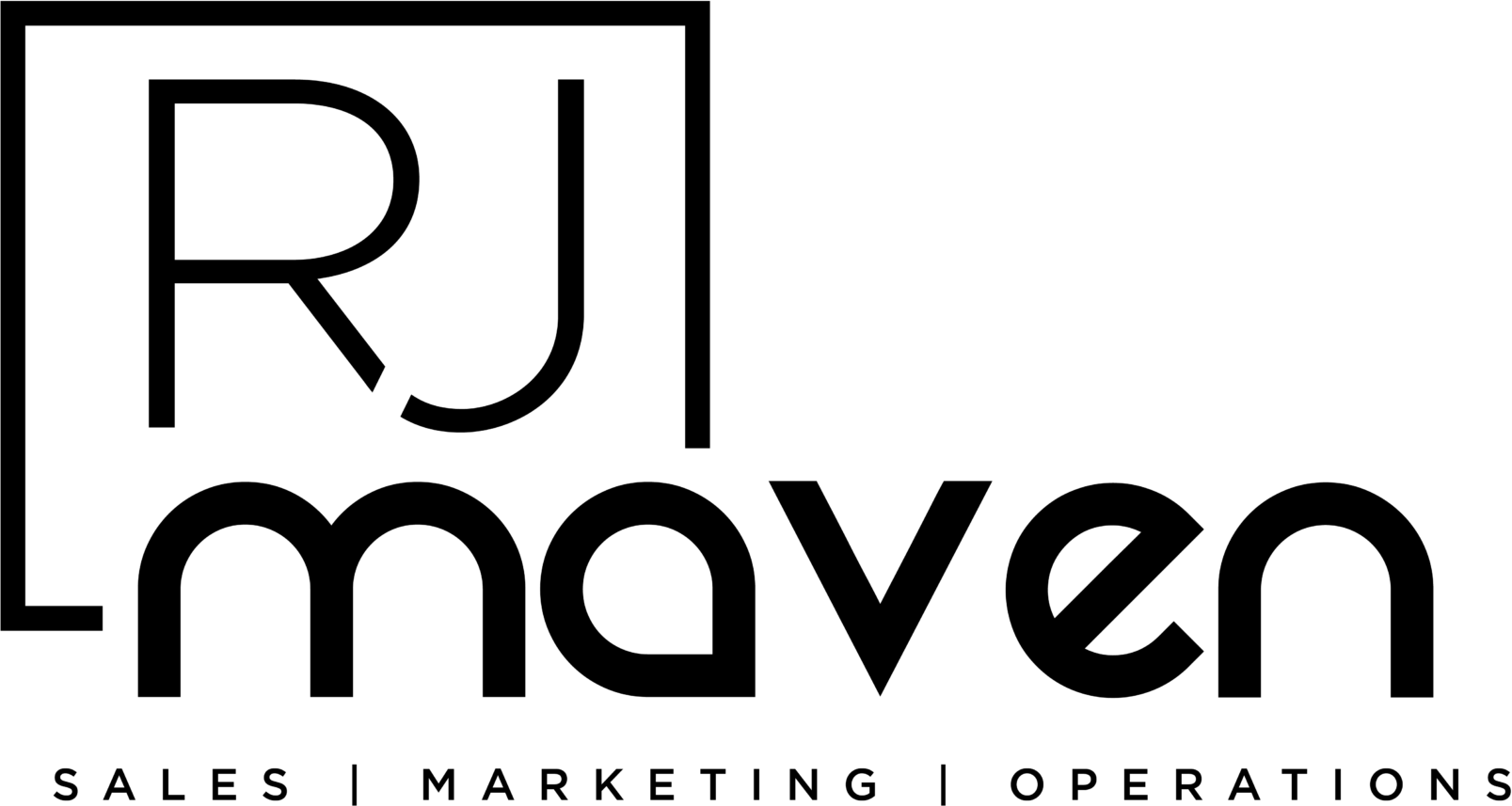
7. RJ Maven
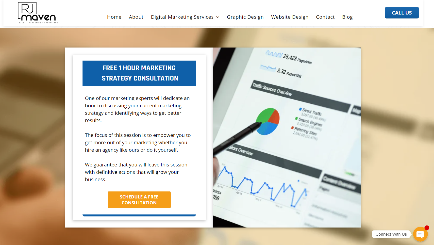
Another great example of a CTA created with a target audience's interests in mind. Let's face it, digital marketing can be weird and complicated for the untrained. On top of that, a one size fits all approach rarely works in this field.
This CTA offers free 1-hour marketing consultation and explains what will be covered during the session. By doing so, this
Alexandria, MD digital agency
ensures its potential clients have the time to explain what their needs are and how the company can help. This strategy has proven to be quite effective as it allows for a more personalized approach that drives conversions.
8. DRT Inspires

Good Wording is key. Especially if you are in the business of coaching. The trigger here starts at the top, with one simple question. This CTA first catches the reader's attention, then explains what the service they offer includes, and closes with a simple yet effective Get inspired.
The benefit of this approach is that it allows the user to understand what they will get by taking action and how it can help them achieve their goals. Creating a more personal connection with the user is an effective way to increase conversions.
9. Amor Studios
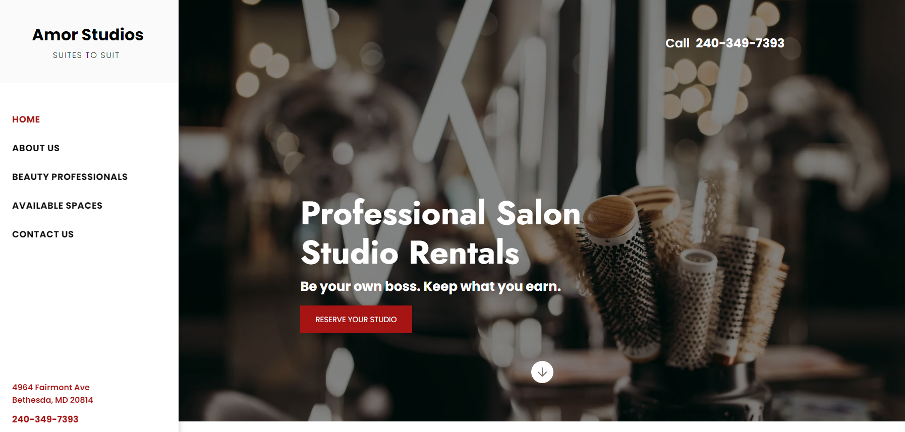
Simple is always better, especially when it comes to effective Call-To-Actions for your website. Amor Studios is a Professional Salon Studio Rental service for Stylists. They understood the problems behind the traditional Salon business model and created a new one that would allow Stylists to have complete freedom.
The CTA on their website is a great reflection of that idea. "Be your own boss. Keep what you earn." this is a strong way to catch the attention of interested visitors. After that, a quick, concise, and effective instruction is displayed on a bright red button. By keeping it short and sweet, Amor Studios manages to effectively explain what they do and how it can benefit the user.
10. Goodtimer
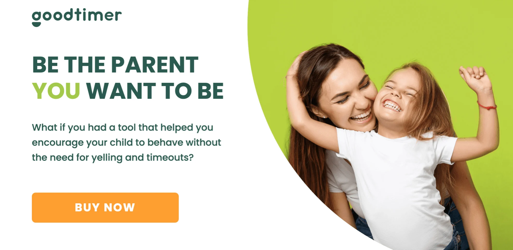
Another great and simple Call-To-Action example. BUY NOW on its own may not seem to amount to much. However, combining a simple instruction with a picture that conveys the message of your brand, and wording that clearly explains the benefit of their offer is a great way to encourage users to take action and buy their products.
Get started with SEO today!
We can Help
11. VRBO
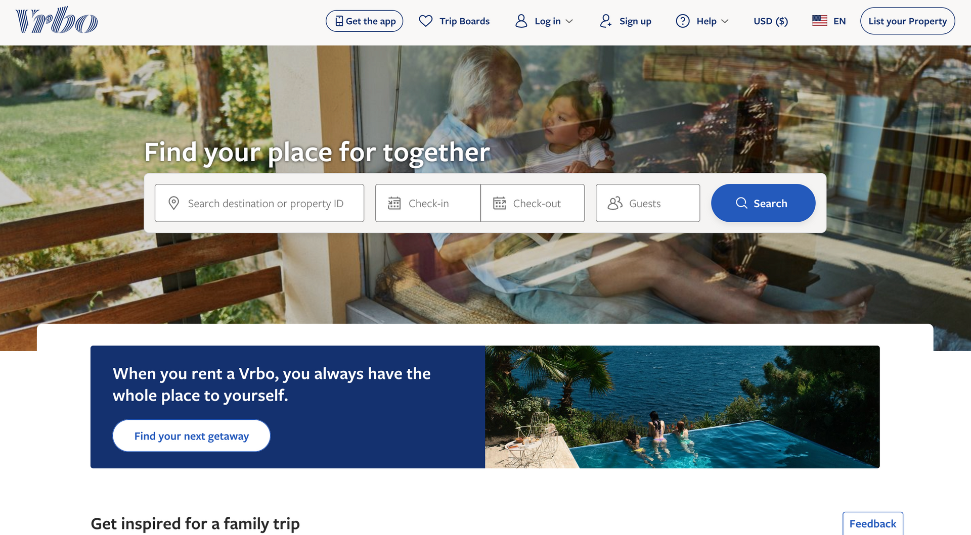
Remember when we mentioned that the concept of a CTA extends to the colors, wording, font, and design of its space on a website? Well, VRBO certainly knows how to do it.
The dark blue CTA stands out against VRBO's website's white background, enticing the user. Then, for those who are looking to rent a vacation place, the “find your next getaway” button adds a touch of excitement.
12. LeadPages
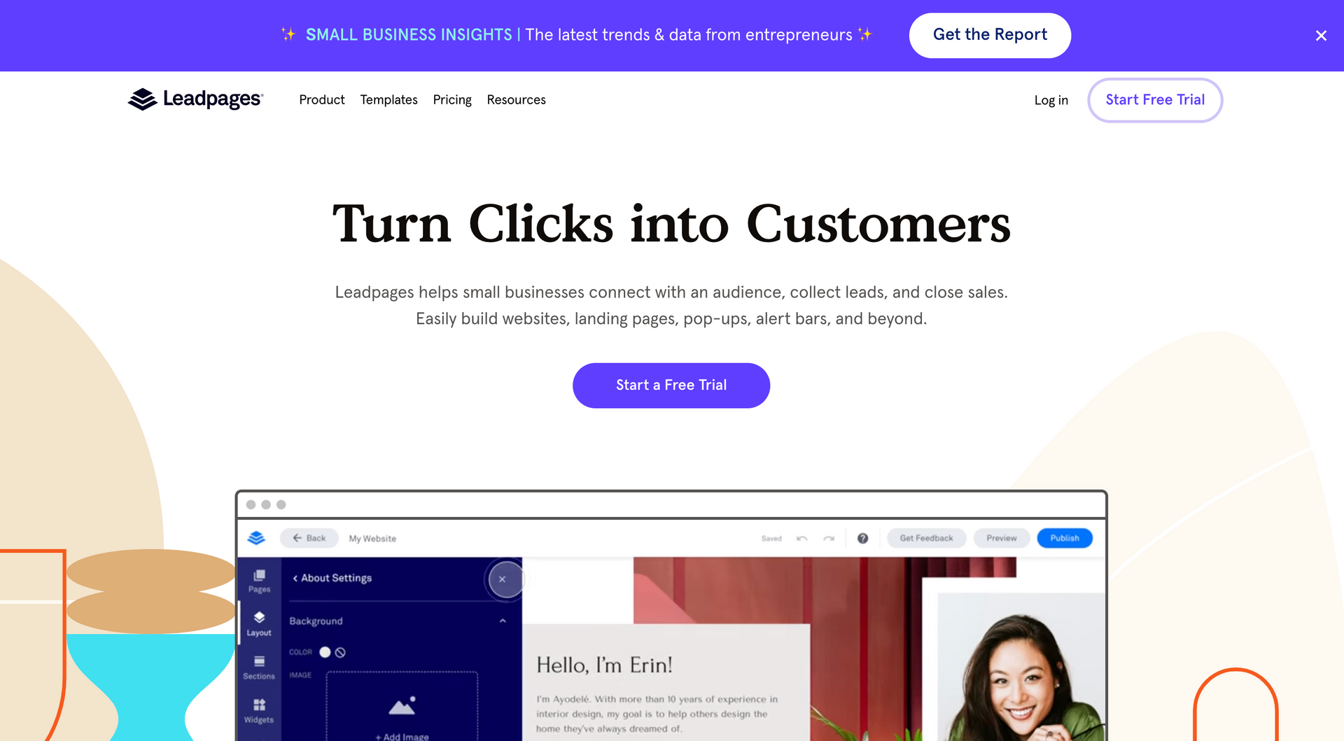
You may be starting to see a pattern here. If you haven't, we'll tell you. Great CTAs are worded in a way that provides a great understanding of the benefits of taking action. In other words, all of the best Call-To-Action examples you will find online provide a value proposition to the reader or prospect in this case.
LeadPages' CTA does just that by saying "Turn Clicks into Customers". Very simple and direct value proposition. Also, by offering a free trial of their product they allow users to try out the product before committing to it. And if they like it, they're more likely to become paying customers.
13. Hulu
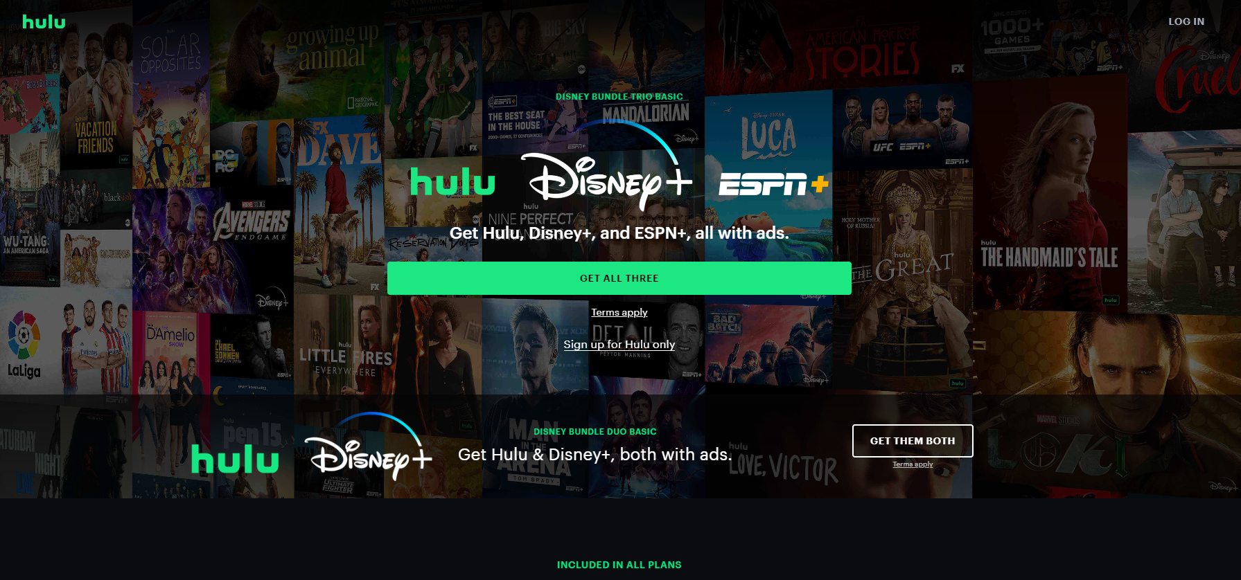
One of the most creative and effective examples on this list. It is clear that Hulu definitely knows how to upsell its services. The dimmed backdrop highlights all of its television and movie options (value proposition), while the CTA's green and white text draws your attention to the offer.
It is very clever the way they use 2 different directives (Get the Disney bundle and sign up for Hulu only). In other words, they are asking you to sign up and at the same time upselling you an add-on on their regular service in one smooth CTA.
14. Hotjar
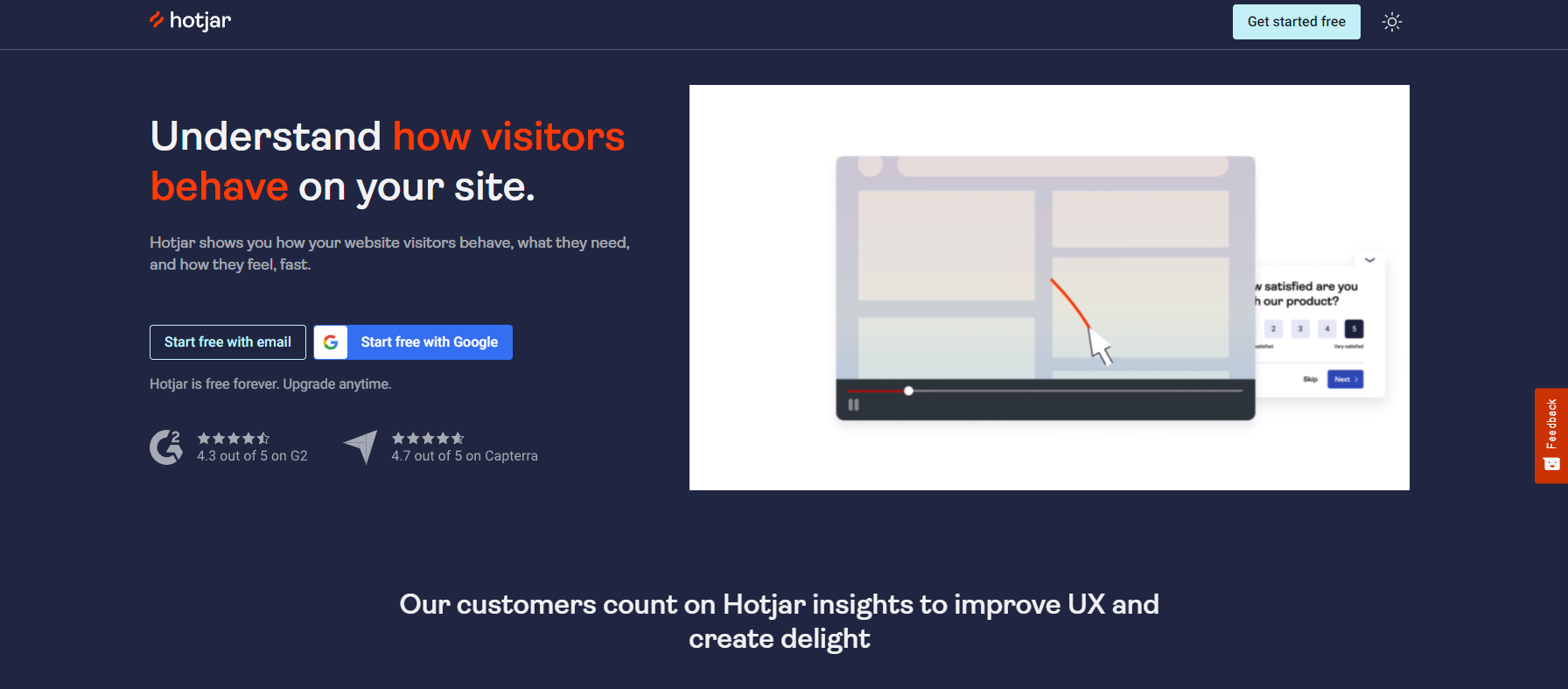
This is an example from one of the industry experts. Implementing a direct integration with Gmail, Hotjar gives their prospective customers a seamless experience--allowing users to sign up in one click. The smoother the sign-up process is, the less likely a potential customer is to abandon their purchase.
15. Evernote
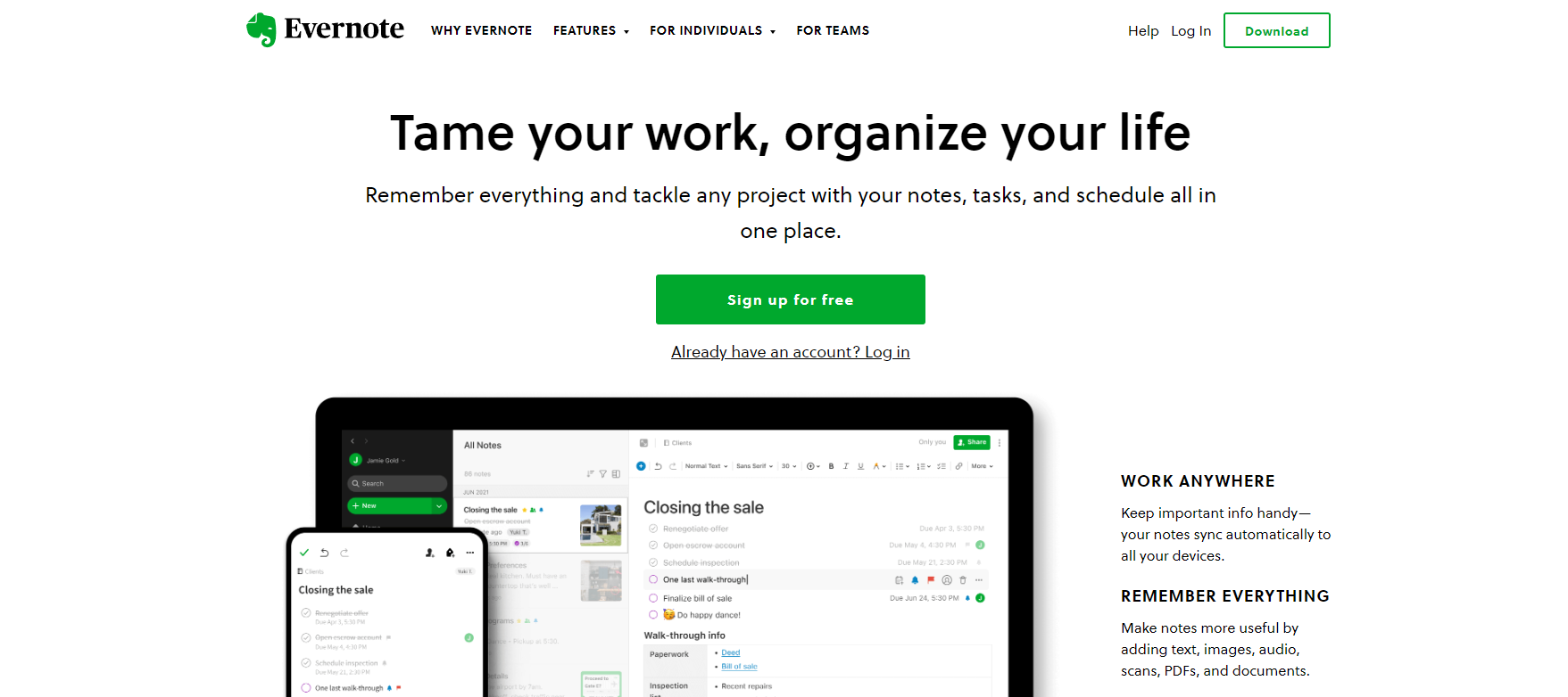
If we ever write a list of amazing tools to increase productivity, Evernote will definitely be on it. This software is designed to help you remember everything and be more organized in both your personal and professional life.
Their CTA does a great job reflecting that by saying "Tame your work, organize your life". It's short, sweet, and to the point. And the bright green button makes it impossible to miss. Also, I want to highlight their use of 2 great words in their button "sign up" (clear instructive) and "free" (the benefit).
16. Officevibe
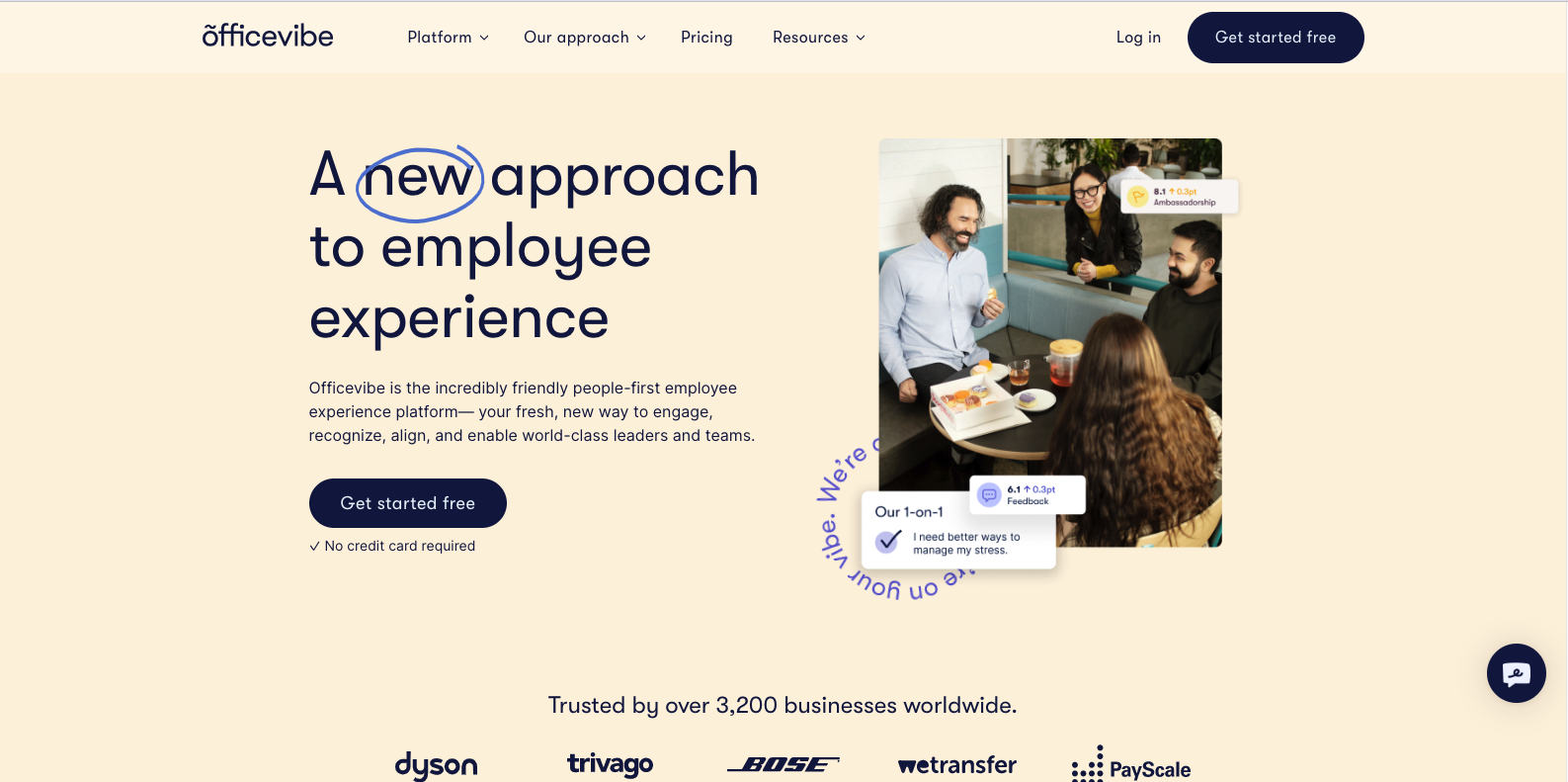
This is another great example of great call-to-action placement and design. As you already know, the best place to add a CTA is above the fold of your website. This example performs 3 great actions that will boost conversions.
First, the copy is simple and direct. Every visitor will know what this brand is all about. Secondly, they highlight the points of interest for the viewer to quickly scan the CTA section. In this case, they highlight the word "new" to convey that their service is non-conventional. Also, they make use of colors that contrast with each other. The white text on the blue button makes it stand out and easy to find. Last but not least, the small line of text below the button that says
"No credit card required"
serves as a reassurance that anyone can start its service for free and that sensitive personal information is not required in the transaction.
17. Billshark
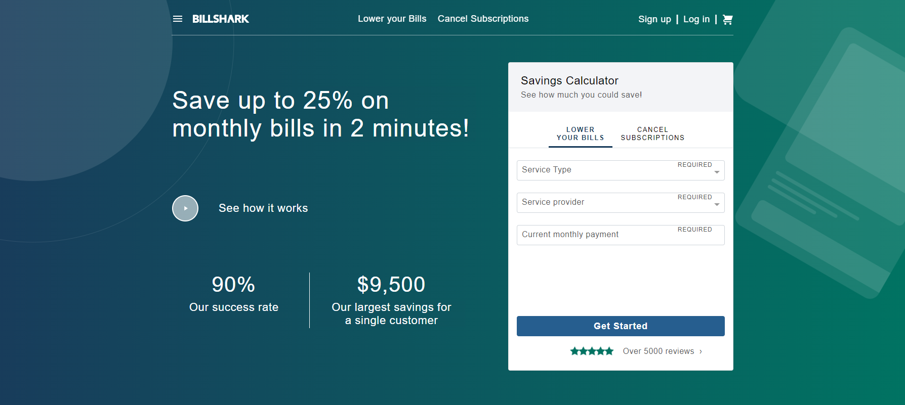
Billshark features a savings calculator with a simple yet effective "Get Started" call-to-action on the homepage. This gives users a glimpse of the effectiveness of their services before taking the next step. Therefore, if they like what they see, they can easily sign up for their services with just a few clicks.
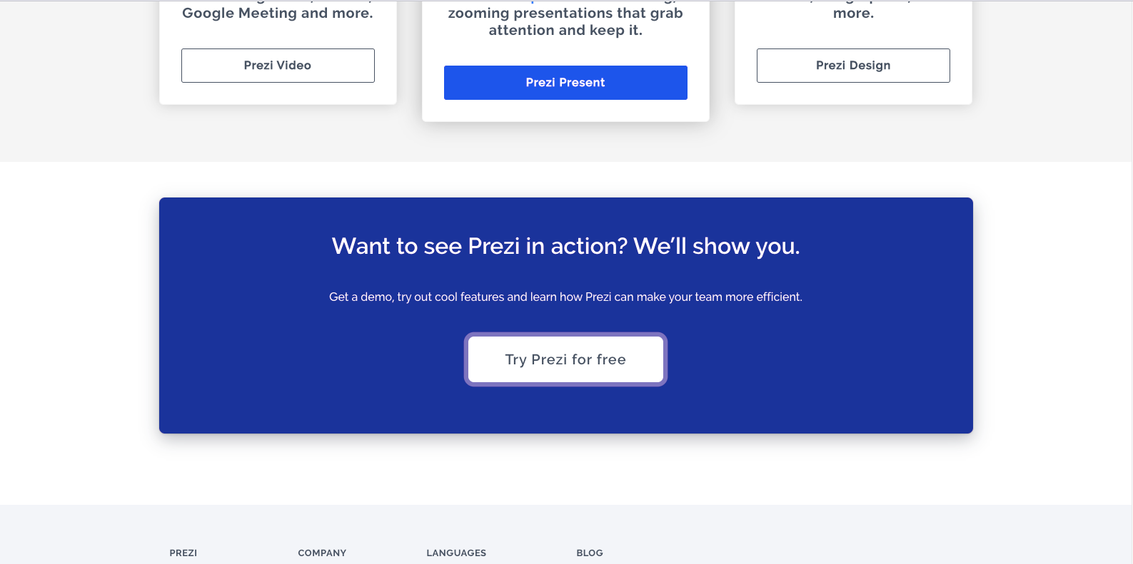
18. Prezi
Being one of the best online services for creating presentations, it is no surprise that their CTA is one of the most effective on this list. By offering a free trial of their product, they are encouraging users to try out their service and see for themselves how easy and fun it is to create presentations with Prezi.
19. Segment
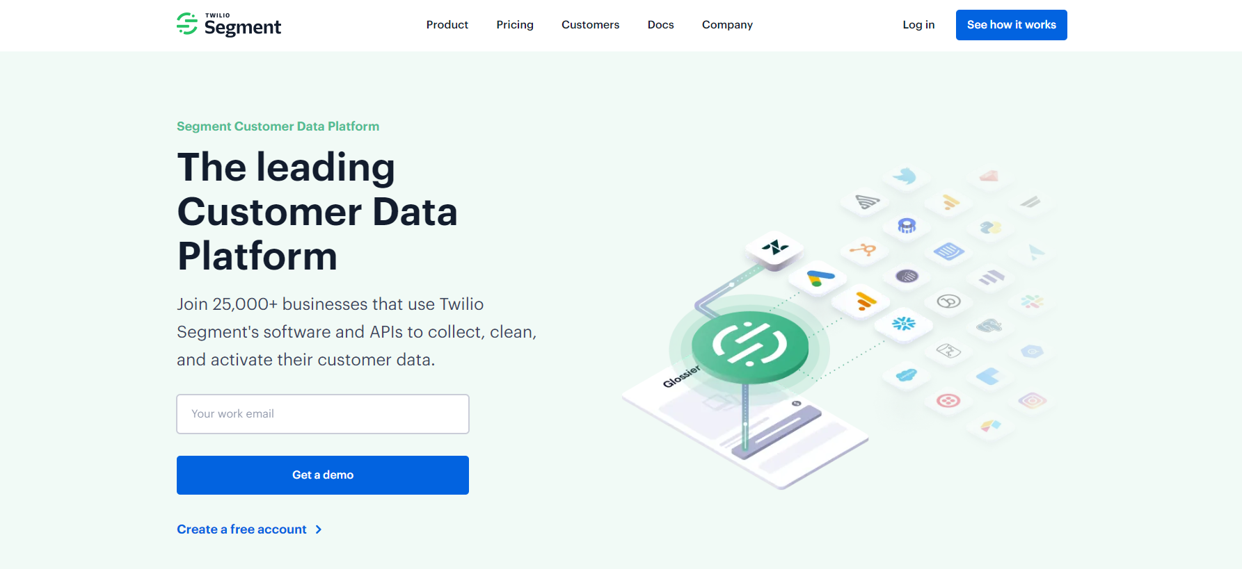
The customer journey for SaaS products is often longer and requires more attention than other types of services. In this situation, "Get a demo" is the best call-to-action alternative.
“Get a demo” is an effective way to encourage your potential customers to follow the right learning path in your funnel.
20. Grey Goose
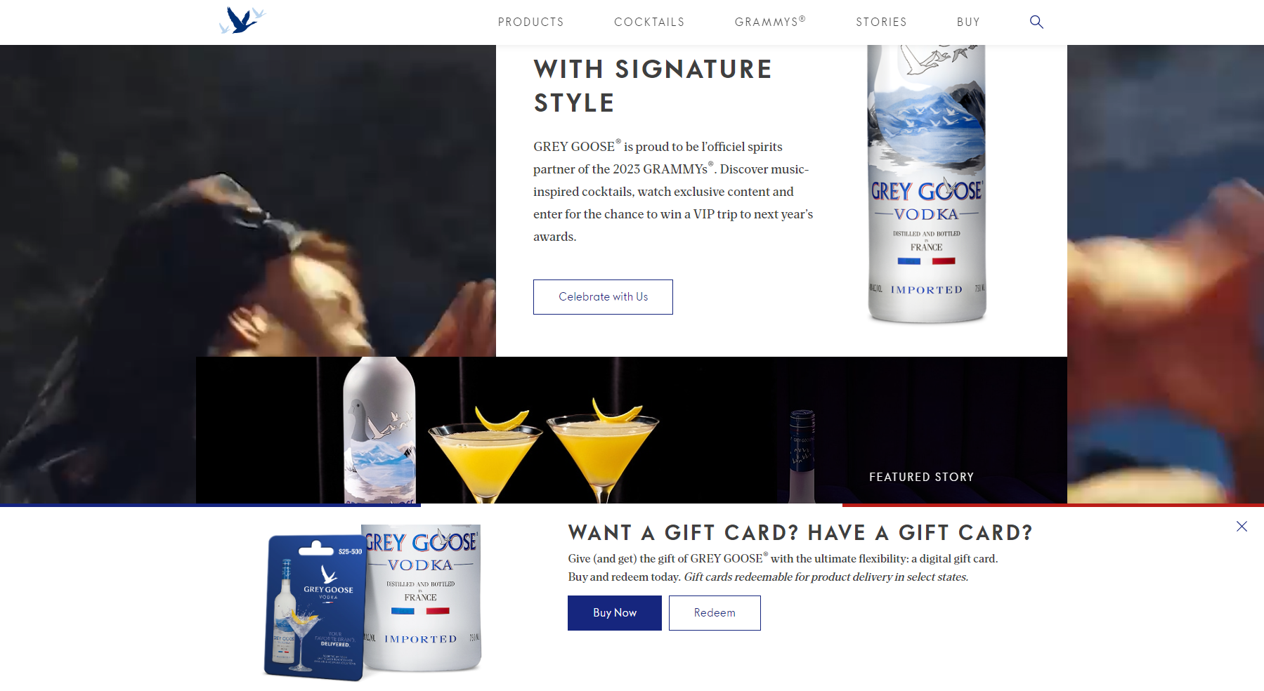
This CTA follows you everywhere you go on their website. It provides clear instructions for 2 different actions defined for 2 different types of customer journeys in the same funnel. Contrasting both buttons with different colors and outlines makes them stand out from the simplistic background.
Get started with SEO today!
We can Help
10 amazing Ecommerce CTAs Examples
The biggest difference between an eCommerce CTA and a CTA for blogs or landing pages is the goal. Usually, CTAs in eCommerce websites are sales oriented. Meaning that the wording of the instructions will intend to persuade the user to purchase.
That being said, here are some examples of eCommerce CTAs that work well:
21. Chewy
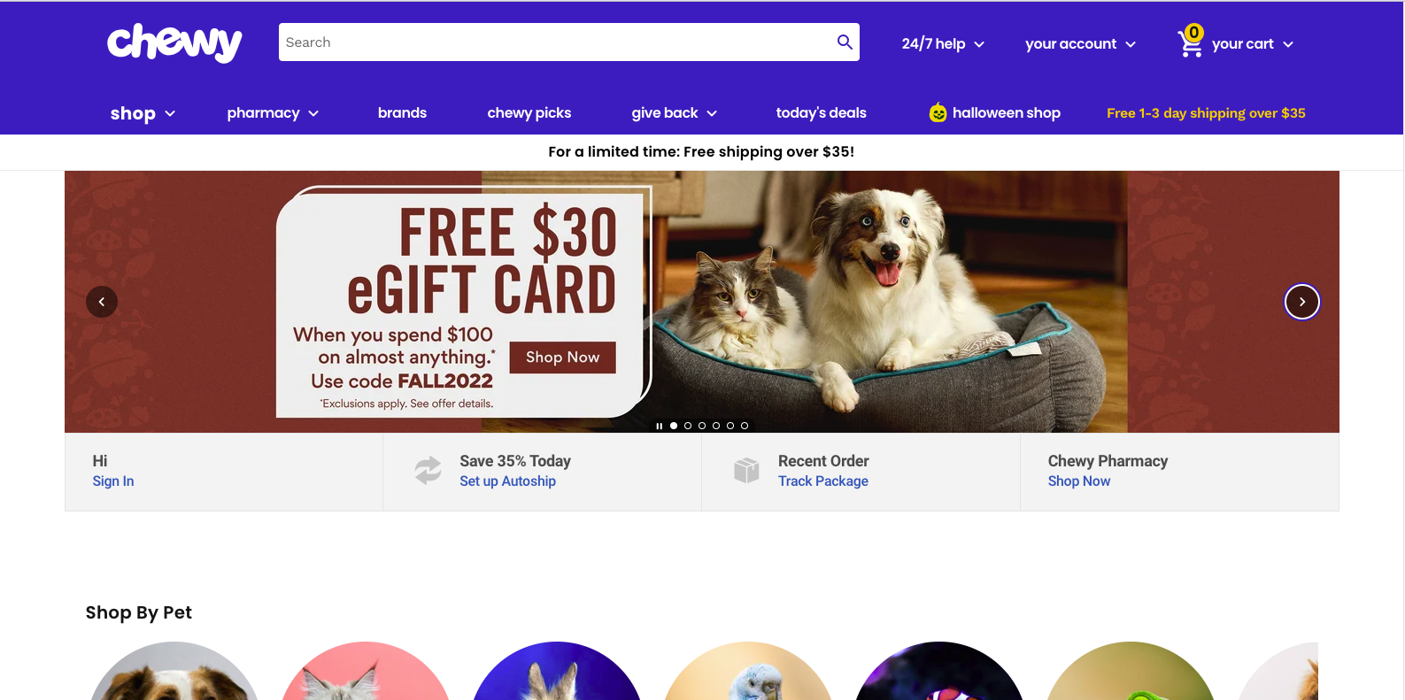
Remember, that instructions are essential for the CTA to be effective. In this case, Chewy tells the user what they need to do, get a free e-gift card. This enables them to entice customers to purchase and at the same time, make sure they spend a minimal amount.
22. Target
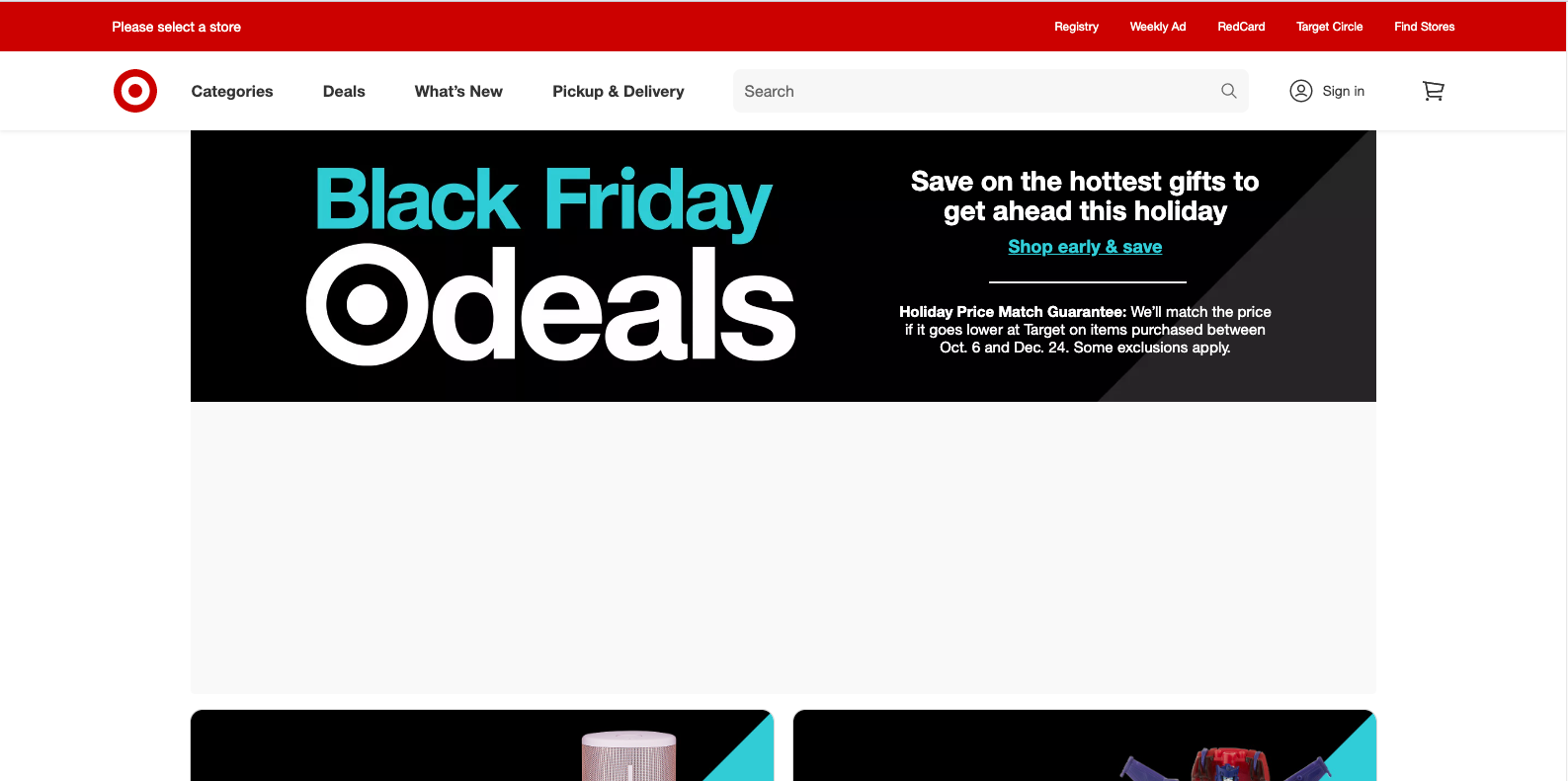
We could easily write a list of great CTA examples for eCommerce sites based on target.com alone. This site is huge on introducing new products and they use their CTAs to perfection. In this case, they went simple but effective. The whole section stands out thanks to the colors they choose. There is plenty of essential information and the CTA instructive is direct (Shop early & save). Telling the user exactly what to do if they want to get the benefits of the sale.
23. Best Buy

We say when someone says run right? But in this case, the CTA is telling us to "act fast" and we do. Wording like "We have a limited time to save $200 on laptops" or in the case of this example " ends tonight" makes us want to purchase right now. Another great aspect of this CTA is that it comes with a link to every category in the store. Making it easier to navigate after they persuade you to buy before the sale ends.
24. Macy's
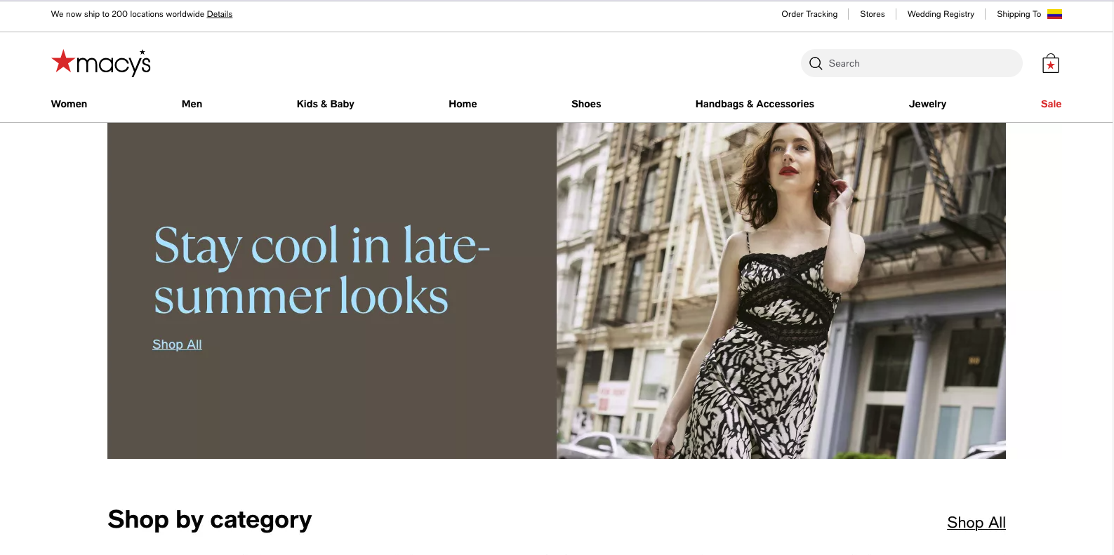
A great Call-To-Action is designed and worded to match its brand identity. Macy's is a luxurious department store and they make sure their CTAs reflect that. They use sober colors, a branded copy, and simple instructions (Shop All). On top of that, the placement of this CTA (above the fold) and the picture of choice improve its chance to convert visitors into customers.
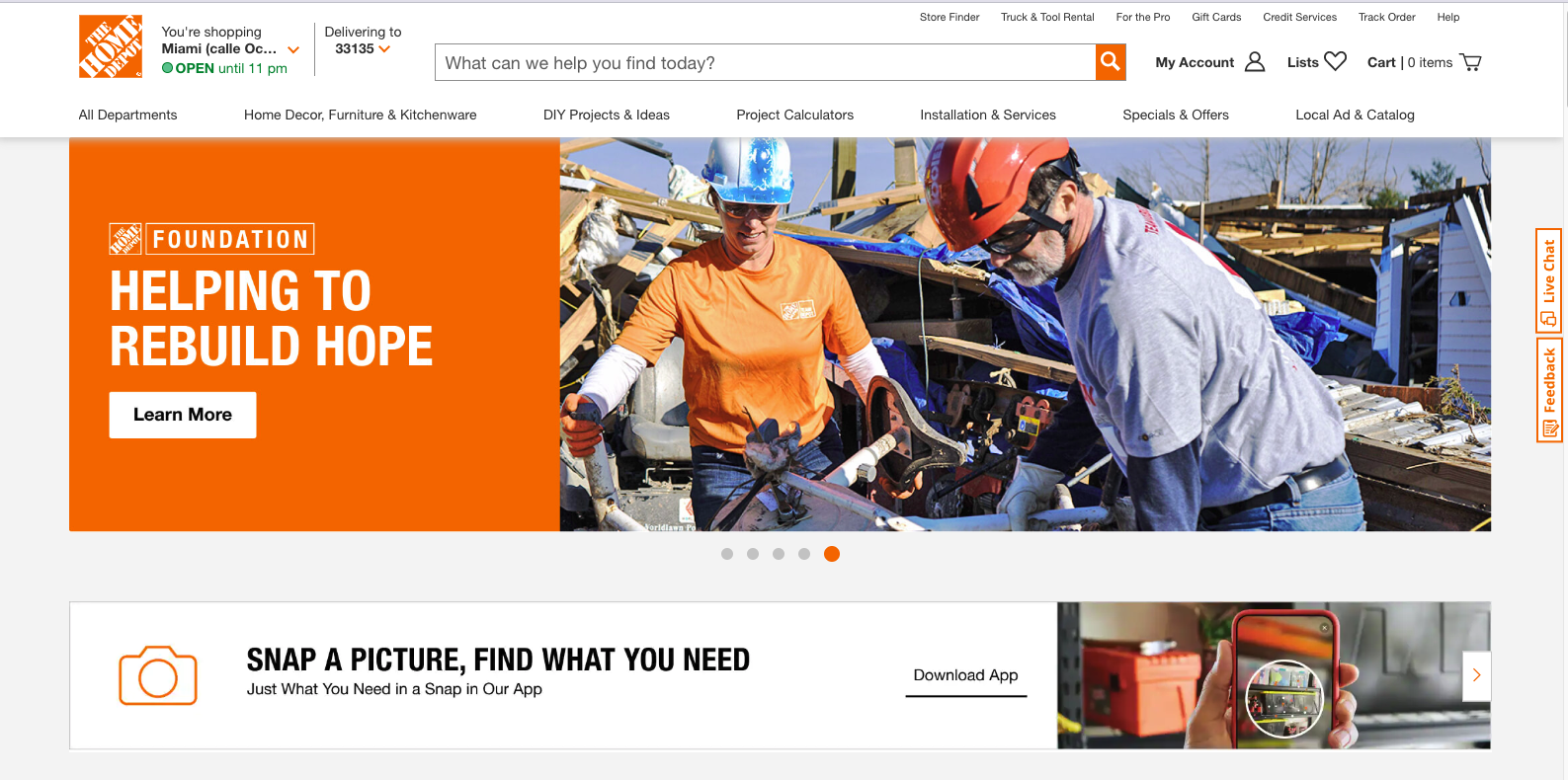
25. The Home Depot
This eCommerce site is thinking outside the box. They are promoting their mobile app by using a CTA that is placed just below the fold. The wording clearly explains what the app is for and the instructive (Download App) is short and to the point. The link goes to the download page on the app store which makes it easy for the user to take action.
This example not only
generates a website conversion (app-downloads) but also promotes in-store purchases.
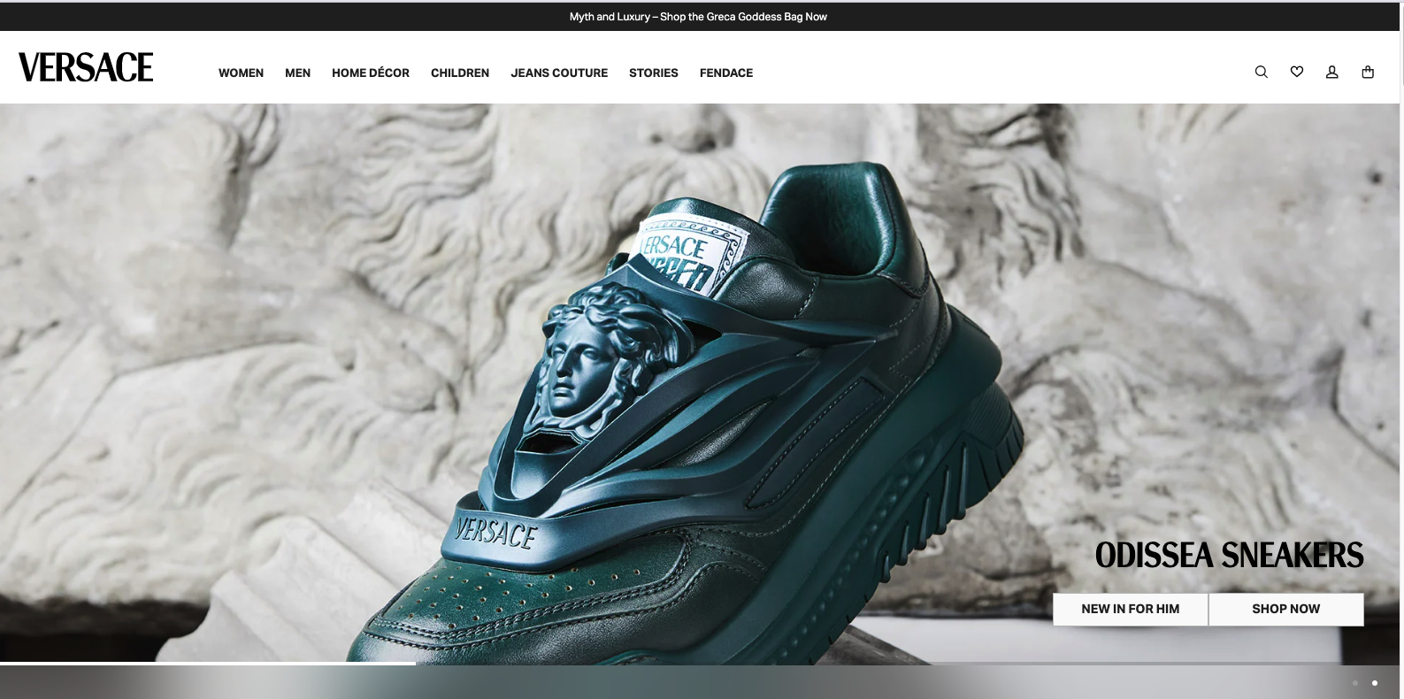
26. Versace
This CTA from Versace is impossible to miss. The brand is known for its high-end products and that's reflected in the copy and design of the Call to action. This is an example of the great use of pictures as a way to convert. The button is simple and in tune with the brand's identity.
27. Calvin Klein
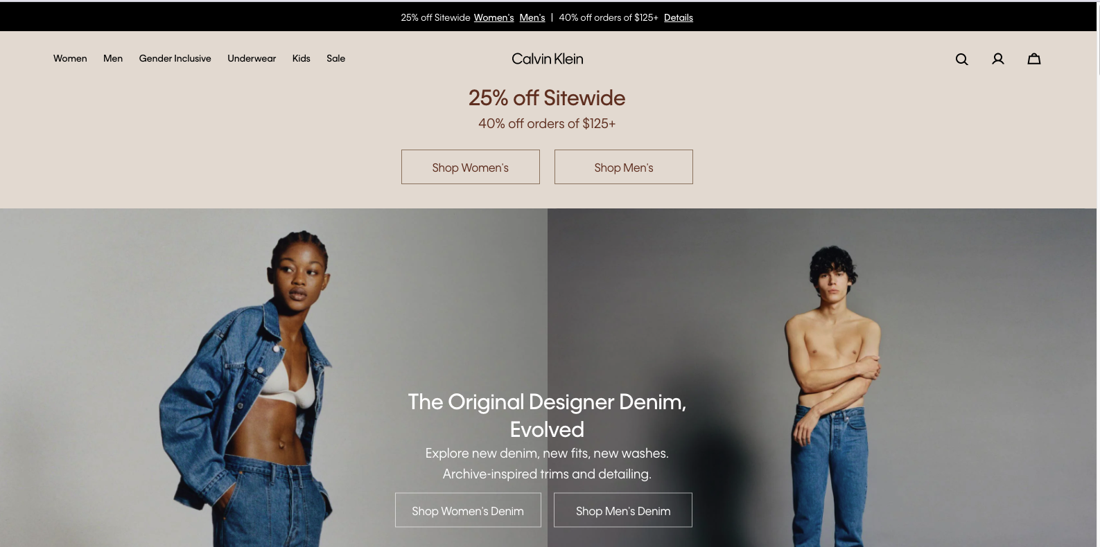
The main goal of every eCommerce is to generate sales. In this example, CK placed their CTA in their website header (great location) and instantly offer 2 different discounts as means to persuade visitors into make a purchase.
28. JuneShine
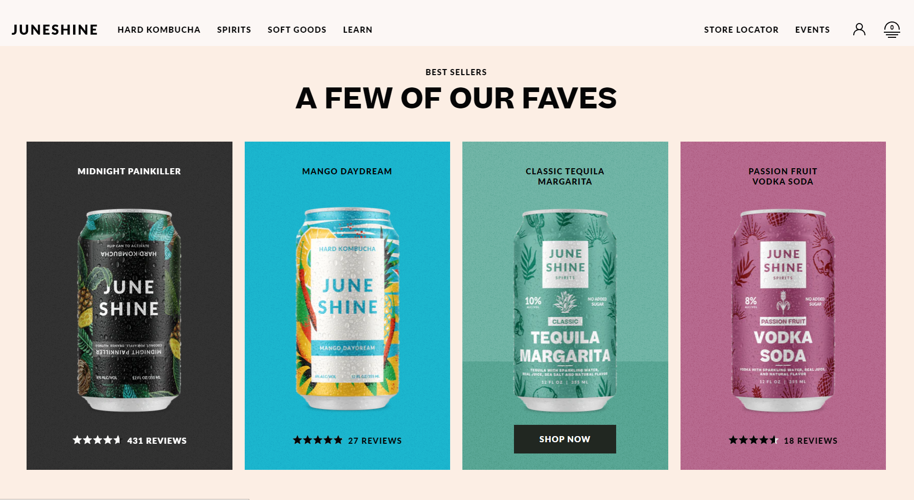
Great use of colors to separate the CTA from the Background. Each of these colored columns acts as a link to a different landing page. The CTA itself is short and to the point, telling you exactly what you need to do. It also provides you with reviews and ratings for each of their flavors. This help to persuade the viewer to click the CTA button.
29. Steve Madden
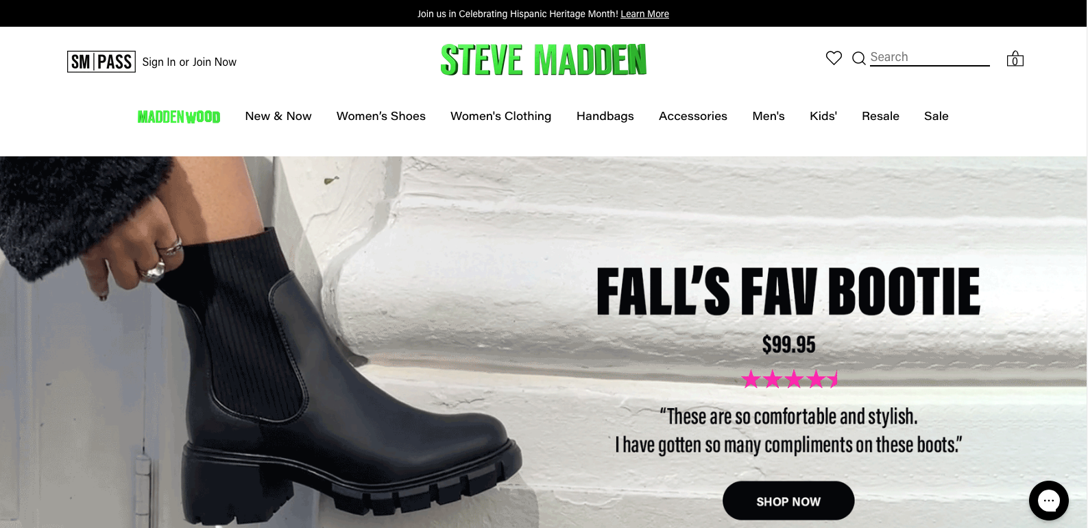
One of the best things you can do to promote your products is to ask your clients for reviews. This is exactly what Steve Madden brought to the table with this great eCommerce call-to-action example. They entice their customers with a great picture of the product they intend to sell, while at the same time bombarding the viewers with tons of different reviews from current clients.
This is a great call to action example for eCommerce websites. Consider using this strategy if you want to improve your website's conversion rate. If you need help creating a website for your brand, in this article you will find
13 tips to make your website stand out from the competition.
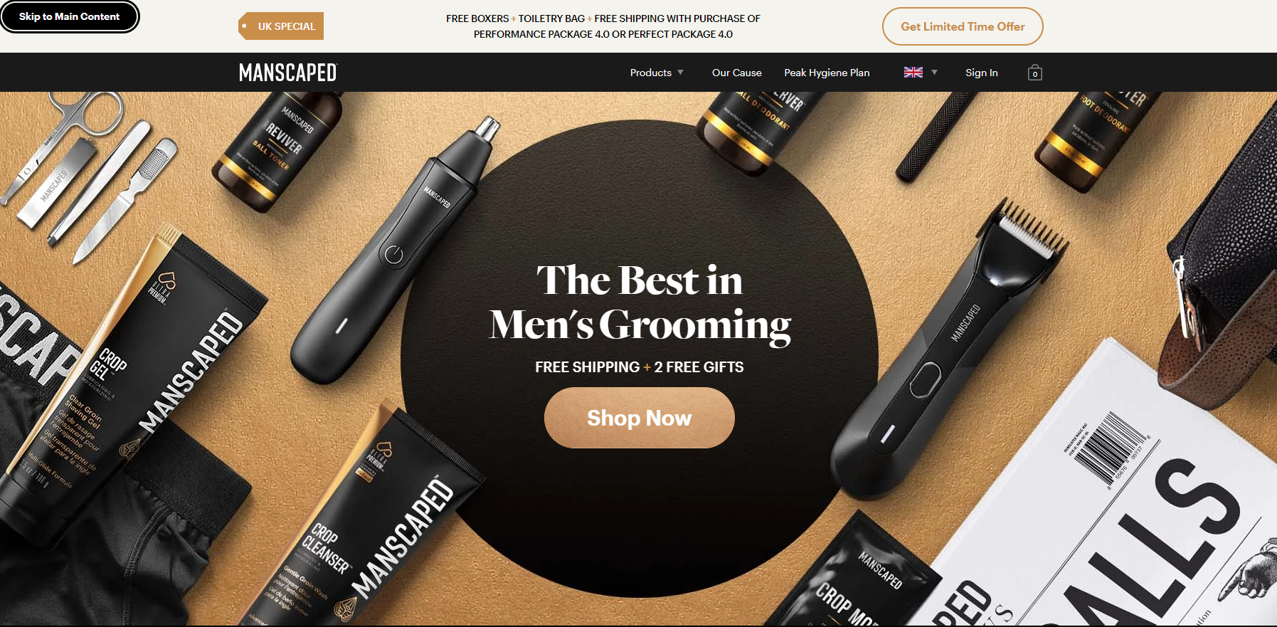
30. Manscaped
When advertising a sale, make sure the call-to-action includes the value proposition of the offer. For example, Manscaped employs the strategy "Get Limited Time Offer." in their header CTA. The CTA section lays out all the benefits, and the CTA emphasizes the urgency of taking advantage of them.
Looking to give your website an edge over the competition?
Check out our web design services!
Our team will work with you
to create a website that stands out and drives results.
20 of the best Pop-Up CTAs Examples
Pop-Ups are great but need to be used carefully. You need to be mindful of your audience when implementing Pop-Up CTAs. You don't want to overwhelm every visitor with tons of Pop-Ups.
However, if you have a website with a lot of content, you might want to consider using a Pop-Up CTA. This will help ensure that your visitors see your CTA therefore, increasing the chance to convert into customers.
One piece of advice, use Pop-Ups that aren't too intrusive and make sure to offer something of value. Also, always set specific triggers for your Pop-Ups. For example, you can set a Pop-Up to show after a visitor has been on your website for a certain amount of time or when they are about to leave your site.
This category can be tricky, that is why we put together some of the best Pop-Up call to action examples we could find online.
31. Sales hacker

I came across this website while researching for this blog post and I think their Pop Up is great. You can see that it is not intrusive and it is relevant to the page content (23 Powerful Email CTA examples). Additionally, the use of vivid colors makes the call-to-action pop against the white background.
32. Aquaspresso
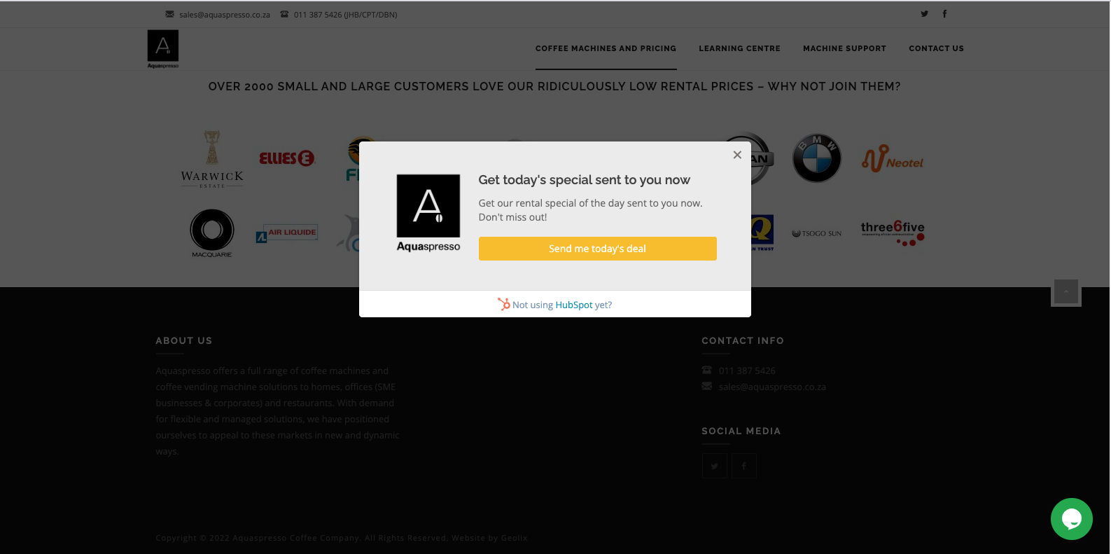
A call-to-action's purpose is to tell your website visitors what you would like them to do next; the best ones do it in a manner that is clear and helpful. The team at Aquaspresso did an excellent job with the pop-up CTA on their website.
Here, the objective is to persuade website visitors to learn what the brand has to offer (and hopefully buy from them). Urging potential customers to explore your most popular products is one way to increase traffic on your website. However, some may see this as too direct of a strategy. That is why we loved this call-to-action example so much. In exchange for an email address, their CTA provides website visitors with "today's specials."
Something that is rare is automatically valuable to us. Adding that the specials are for today only exploits this quirk in our brains. The fear of missing out on today's specials might make people want to fill it out and claim their offer while they can.
33. Lulu's
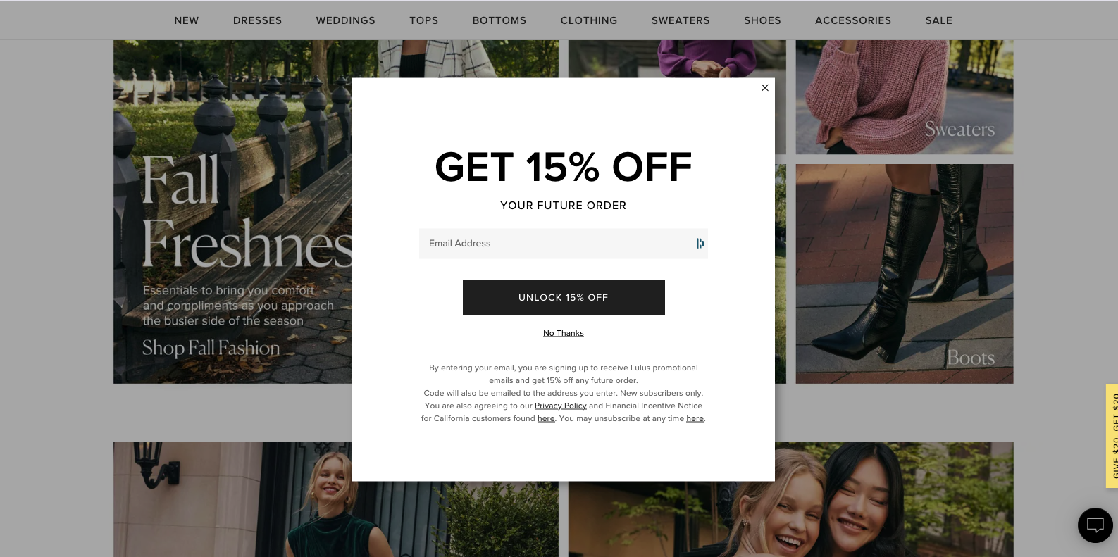
Lulu's is a women's fashion retailer that does an excellent job with their email capture pop-up. Not only is the CTA copy short, sweet, and to the point but they also offer a discount for signing up to their newsletter. Who doesn't love getting discounts?
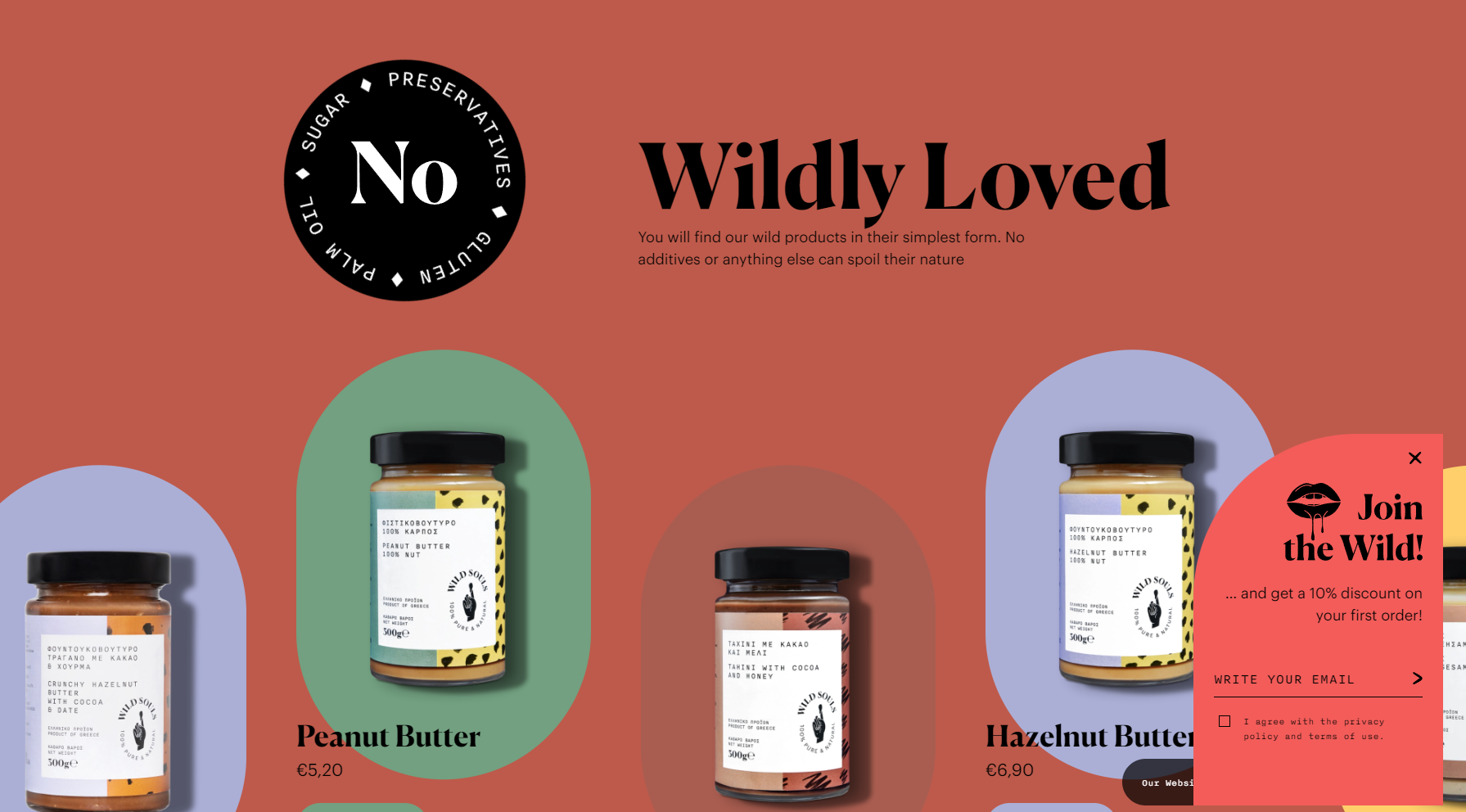
34. Wild Souls
Very outside-of-the-box approach when it comes to Pop-Up CTAs. This website uses a small yet attention-grabbing Pop-Up placed in the corner of the website. The trigger is not invasive at all. The pop-up only shows up after 5-10 seconds which is perfect because it gives the visitor time to explore the website before being presented with the CTA.
35. Absolution
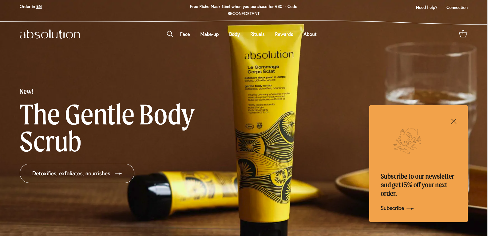
Following a similar approach, this make-up brand has a very discreet Pop-Up that shows up in the bottom right corner after 5 seconds. The CTA is relevant to the website content and it is not intrusive. It also comes with a great persuasive which is 15% of on the next order by subscribing to their newsletter.
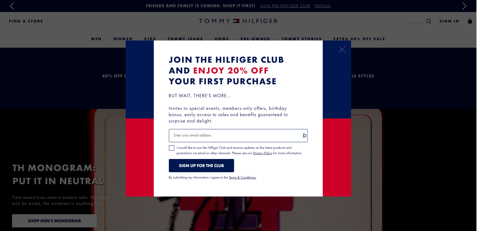
36. Tommy Hilfiger
Tommy comes with a more aggressive strategy. This website uses a full-screen Pop-Up that shows up immediately after opening the page. The CTA comes with tons of information on the benefits you could receive by joining their club. Remember, it is important to always offer something in return for an email address or any other piece of contact information.
37. Blue Apron

Lulu's is a women's fashion retailer that does an excellent job with their email capture pop-up. Not only is the CTA copy short, sweet, and to the point but they also offer a discount for signing up to their newsletter. Who doesn't love getting discounts?
38. reHarvest
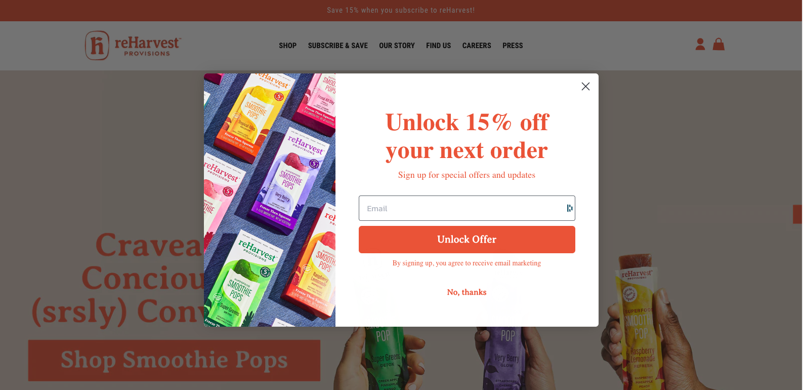
This is a really well-designed pop-up, most of the space is dedicated to provide the user with the information they need (instructive) and the benefit they will get (15% off). The wording they are using for the call-to-action directive (Unlock Offer) is very unconventional and smart. Probably written with the voice of the brand in mind.
39. Mr Blackman's
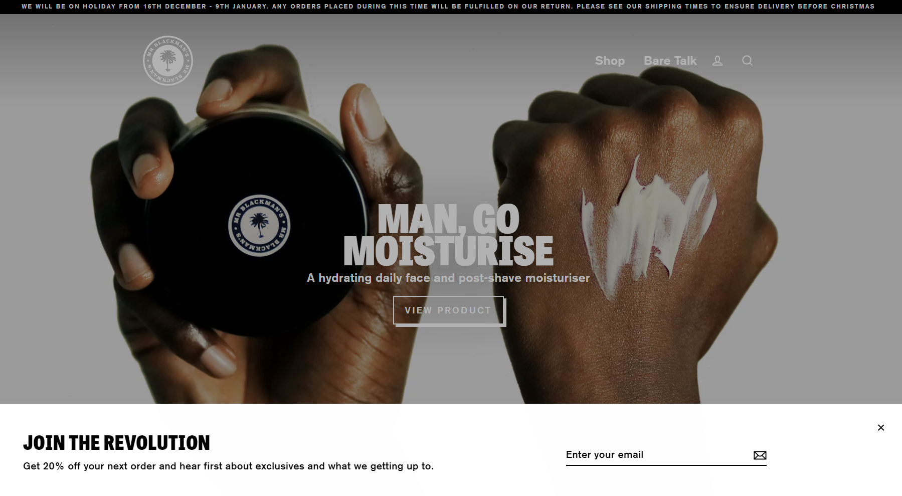
Here is another example of an audience oriented copy. This brand knows how to communicate with their community. The way the copy is written helps the brand to connect and convert with the website visitors. "Join the revolution" is the most prominent element on the pop-up, with the rest of the design being clean and simple. Great example of a pop-up call to action on a website.
Looking to give your website an edge over the competition?
Check out our web design services!
Our team will work with you
to create a website that stands out and drives results.
40. Kind Socks
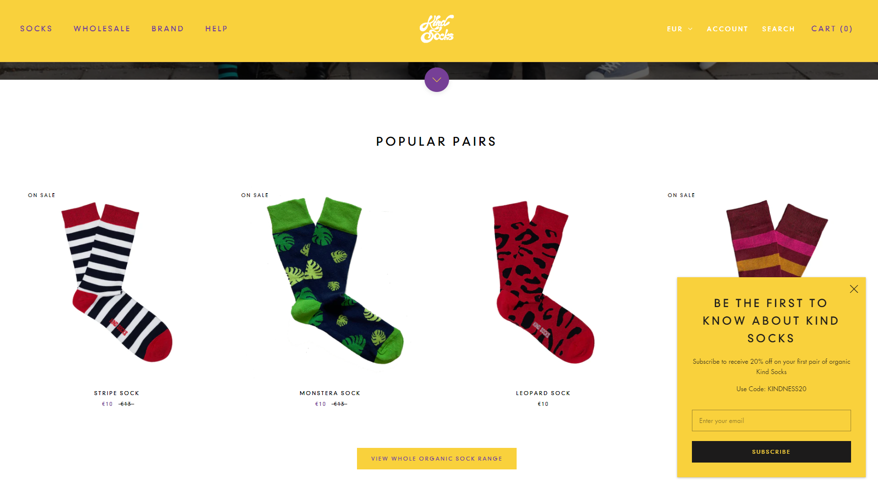
You may have noticed a trend in our picks for this category. Yes, we love pop up call to actions that are not invasive or overly aggressive. In this case, they went with a simplistic approach. Simple copy, simple colors in tune with the brand and the best part of it all? The pop up doesn't show up until you try to leave the website. This way you avoid interrupting the user's experience and you still get the chance to capture their information before they leave.
41. Always Fit
I think I found more than 3 great examples of call to actions in this website. Let's start with the first one. This pop-up call to action is a great example of a brand that has a strong focus on its customers. The CTA is clear and to the point, and it's easy to see how this would be effective in getting people to sign up for the brand's newsletter.
A clear benefit for the user, clear set of instructions and a great design make this CTA a winner.
42. Numa Foods
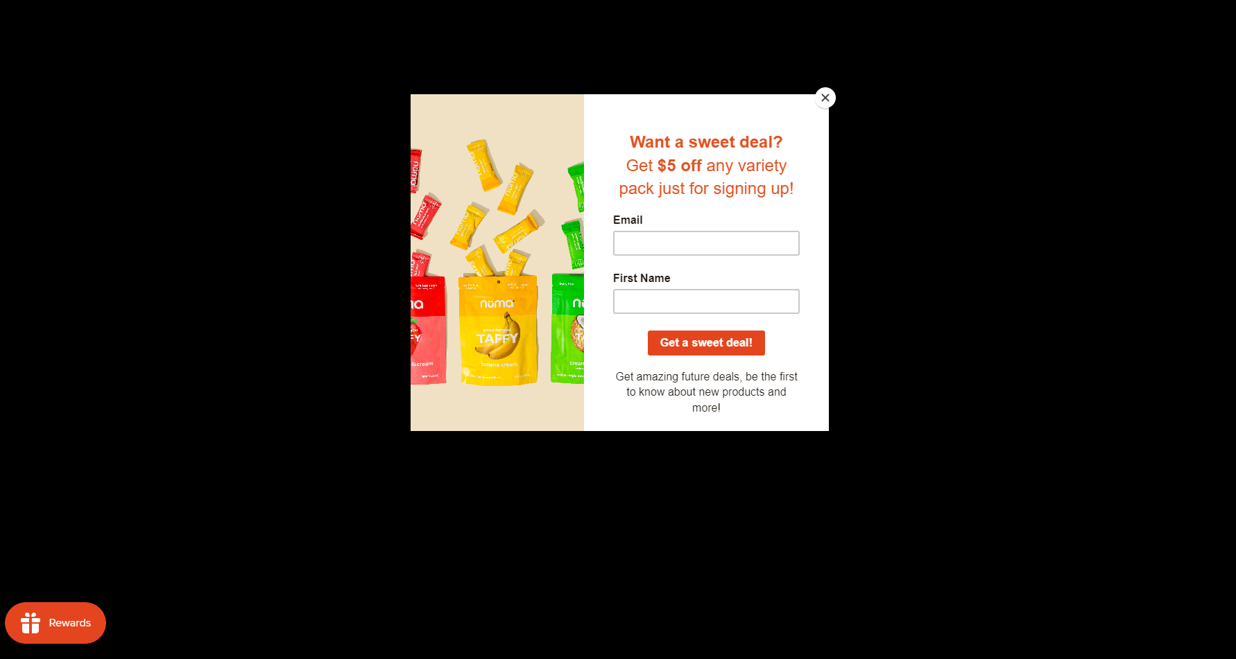
Usually, websites dim the background behind the pop-up call to action in order to make the CTA stand out more. However, this website goes way beyond that and it works really well. The completely dark background makes the white CTA
design stand out from the competition, and the use of a candy-related image and the wordplay in the wording help to drive home the message that this is a website about candy.
43. Omsom
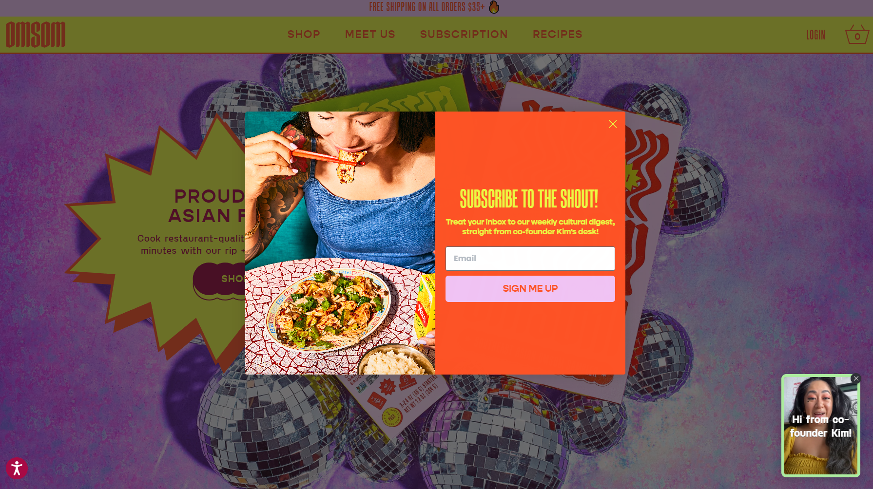
For this example, we will use Omsom's brightly-colored website which includes a similarly vibrant email opt-in pop-up. This particular example has an exit intent trigger. Exit-intent pop-ups are designed to catch your attention in a split second before you close a tab or window.
44. Semicolon
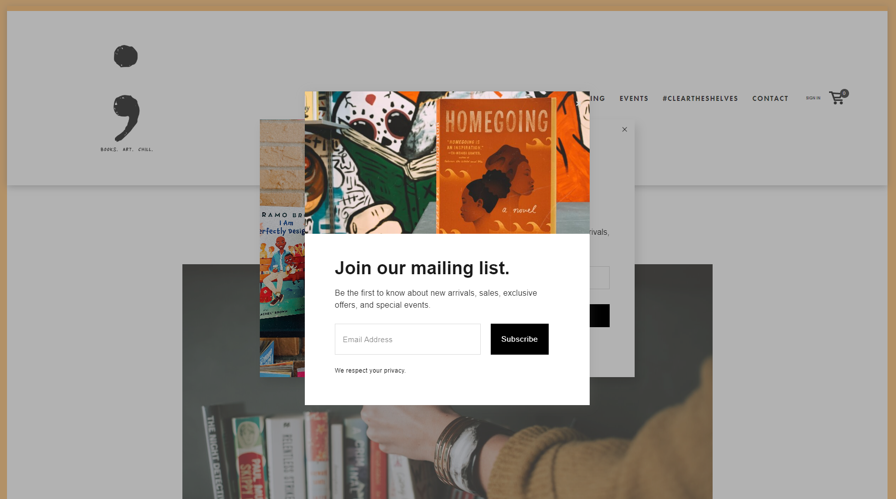
The Semicolon Bookstore website's CTA does an excellent job of explicitly stating the benefits of subscribing to its email list without being too distracting. If users want, they can read the text; if not, they can skip ahead to sign up.
45. Noodz
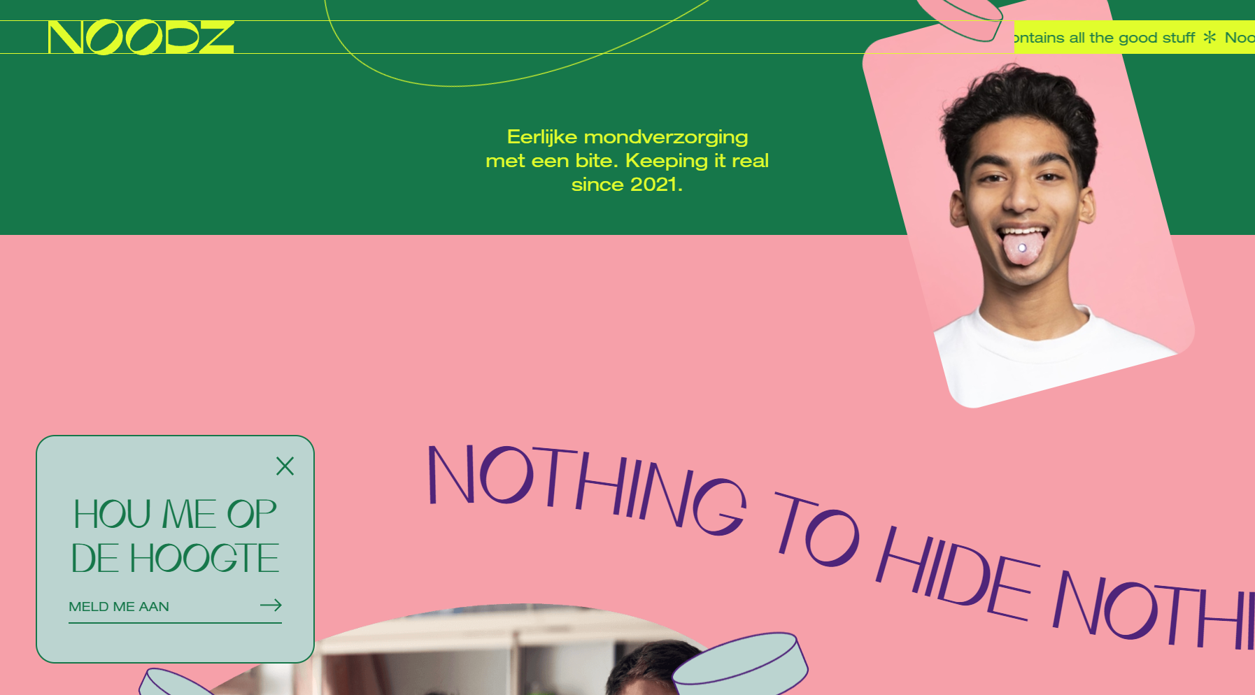
Noods is an organic, vegan oral care company. The homepage features another non-intrusive sticky pop-up that compliments the rest of the website. Once clicked, it will open a larger landing page and request four distinct pieces of information from the user. Too much information on the first pop-up can be overwhelming and a turnoff for potential customers, so it's best to save that space.
46. Sienna Sauce
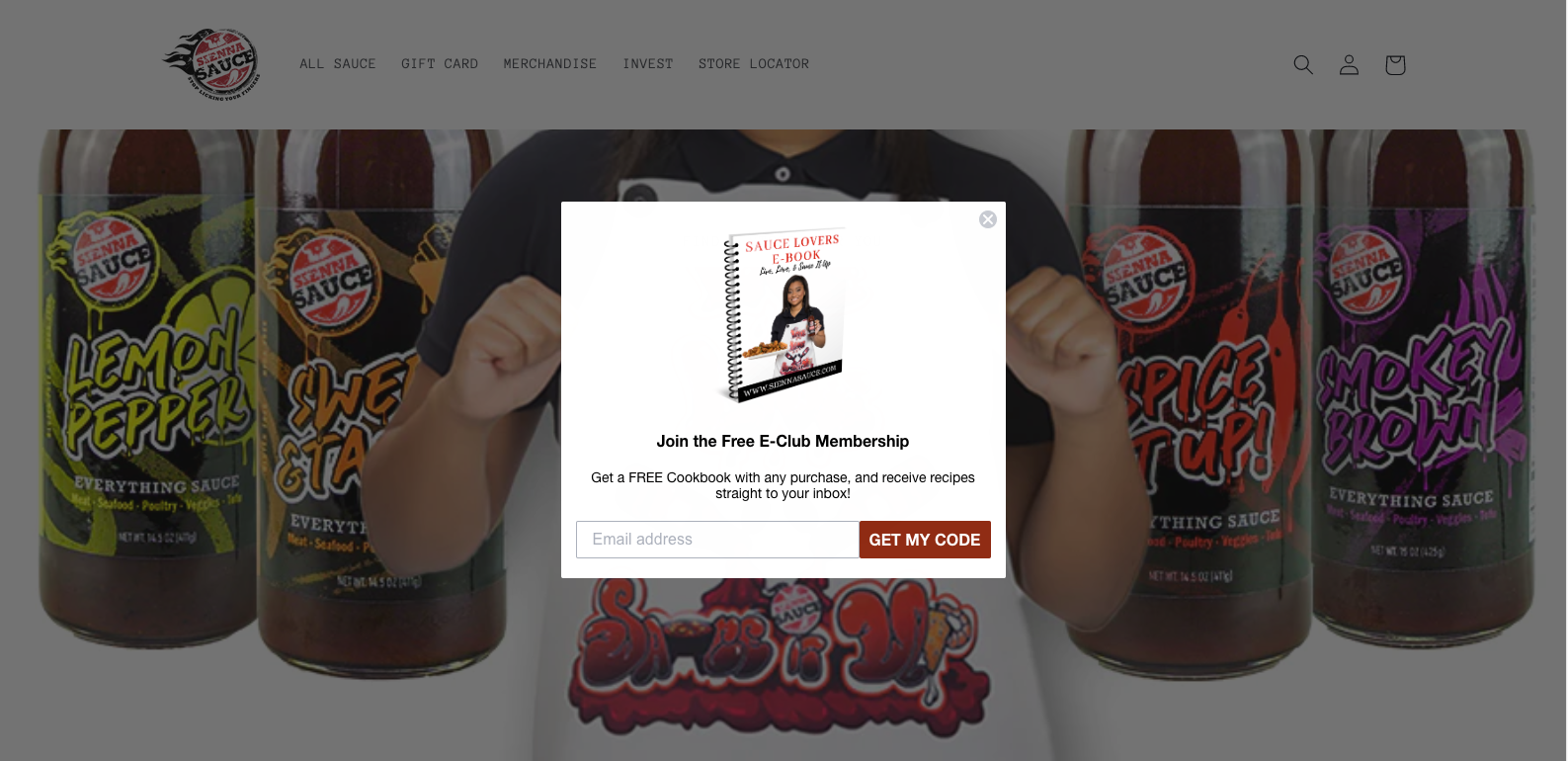
The main idea behind offering a gift upon registering for a newsletter is to increase the conversion rate of an ad or in this case a CTA. Sienna Sauce uses this ploy and offers a free E-book for signing up for their newsletter. This is an excellent way to get people to take the next step, and it's also a great way to increase brand loyalty.
47. Google Business Profile
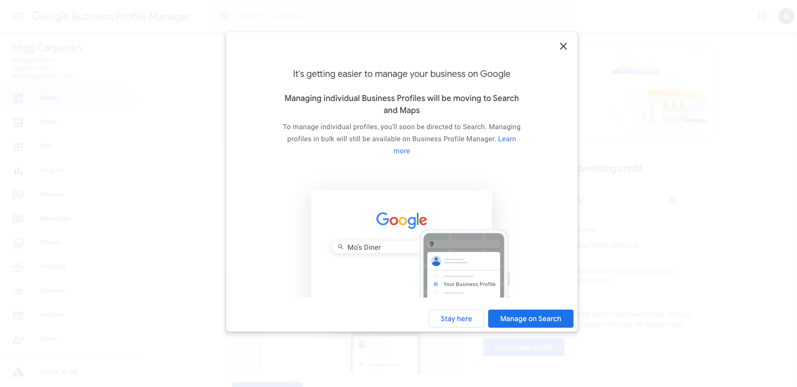
Not every pop-up or call-to-action goal is to drive sales or generate leads, sometimes it's simply to get people to sign up for something. In this case, Google Business Profile is using a pop-up window as a way to update users on changes on its platform.
The CTA is short and easy to follow. Since this is an update announcement in many ways, makes sense for this pop-up to capture the whole screen. That way, Google makes sure that the users learn what's new before actually going inside the platform.
48. Pop-Up Smart
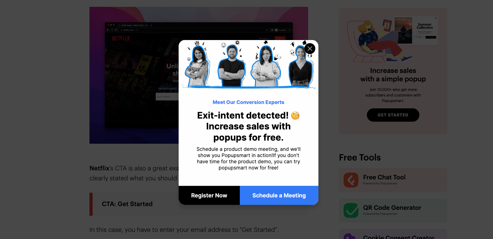
Going back to a more traditional approach, in the CTA example, Pop-Up Smart uses an exit intent triggered CTA to capture the user's attention and get them to register or schedule a discovery meeting with potential customers. This particular CTA is very well-designed, and it uses a color scheme that compliments the website's design without being too intrusive.
49. WWF
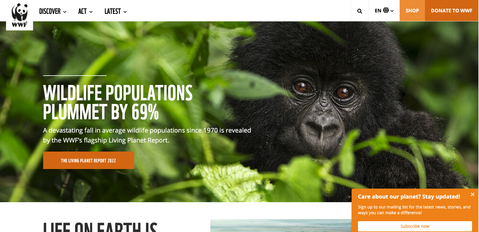
Remember we mentioned before that an effective call to action is one that speaks directly to the brand audience? WWF's CTA does just that by using language that is geared toward its main target: people who want to help save the planet. It is a simple emotional trigger in many ways, to whoever lands on this page. Care about our planet? Stay updated! is a great way to catch the attention of qualified traffic and increase conversions.
50. Beefeater Gin
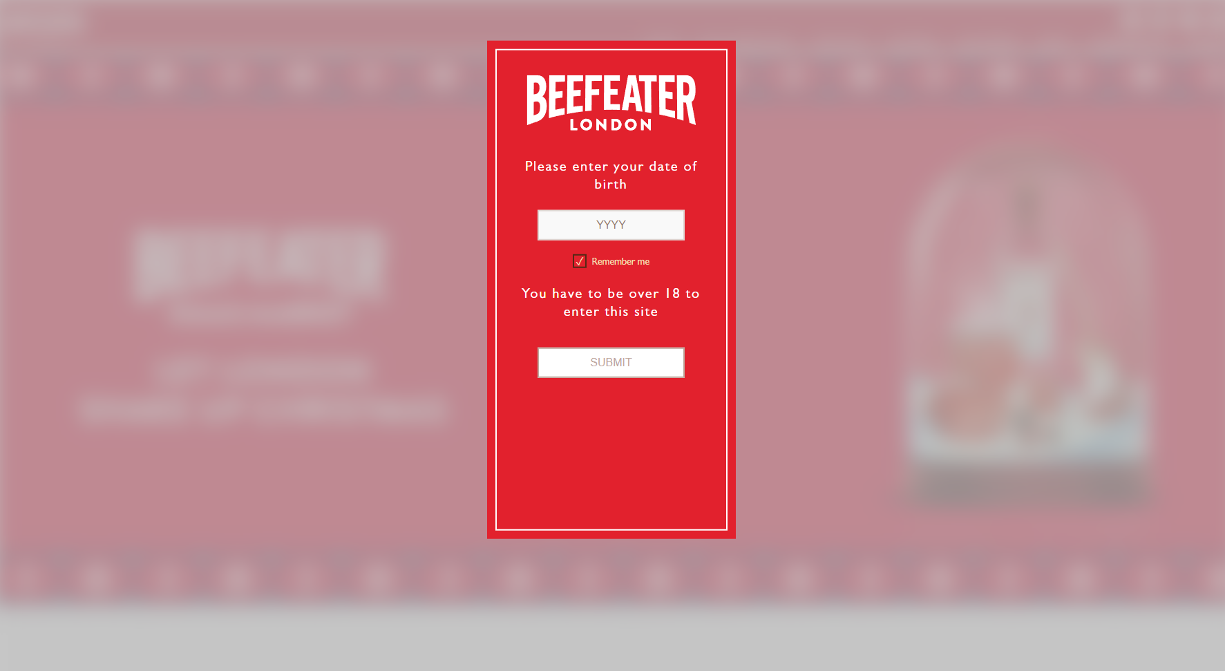
In a similar fashion to Google Business Profile, Beefeater Gin is using a pop-up to educate users about its product. In this case, it's a bartender explaining the perfect way to mix a Beefeater Gin cocktail. The CTA is very straightforward: learn more, and it's placed in a highly visible spot on the page.
Looking to give your website an edge over the competition?
Check out our web design services!
Our team will work with you
to create a website that stands out and drives results.
Another 10 great eCommerce CTA examples
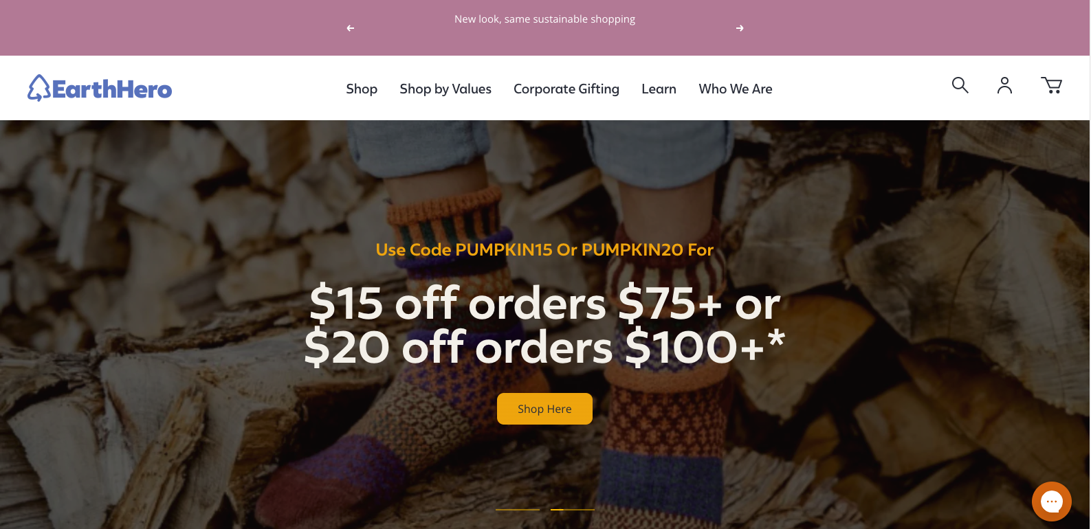
51. EarthHero
Less than a few things can catch website visitors' attention as well as a discount. It doesn't matter if the discount is on shipping fees, 10%off on the first order, or in this case a discount for orders over x amount of money. Who doesn't like a good discount?
It's important to keep in mind that a CTA should never be obtrusive. The last thing you want to do is make your website visitors feel like they're being bombarded with too much information or pressured into taking an action they're not ready for. EarthHero's CTA does a great job of seamlessly integrating into the overall design of the website without being too overbearing.
52. The Sill
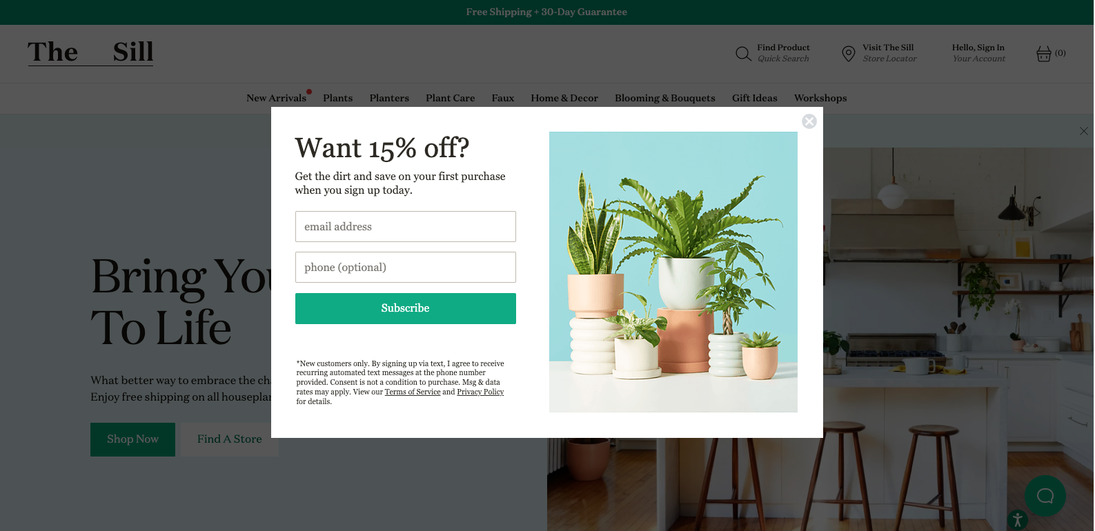
Offering discounts is always a great way to increase conversions, and The Sill does this perfectly with their CTA. However, they go above and beyond with this CTA example. This CTA also acts as a way for the company to capture customers information. By doing this, The Sill is able to remarket to these customers in the future and continue building relationships even after they leave the website.
53. The Sill (Again)
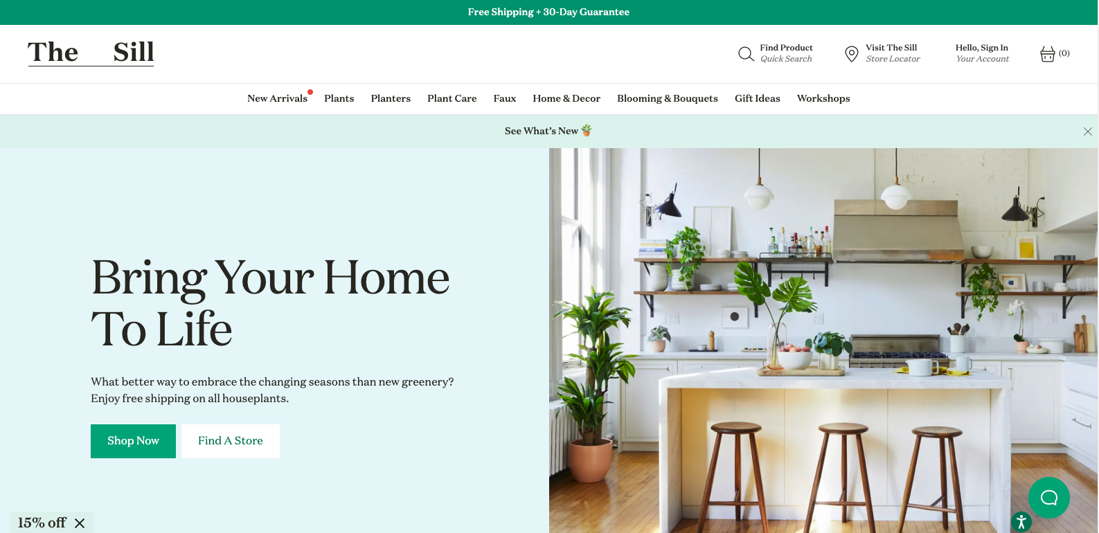
We had to include another CTA example from The Sill because they're just that good. This CTA is a great way to increase in-store conversions by promoting the user to "Find a Store". This is a great way to connect with their audience in off-line interactions.
54. Banana Republic

In order to be
successful in marketing, it is key to increase the average order value. A higher average order value improves the return on investment for advertising and grows income. Have you ever noticed that after adding an item to your shopping cart on Banana Republic's website, they have a call-to-action that says "Keep Shopping?" This encourages the customer to add more items to their cart and increases the average order value.
55. CCS
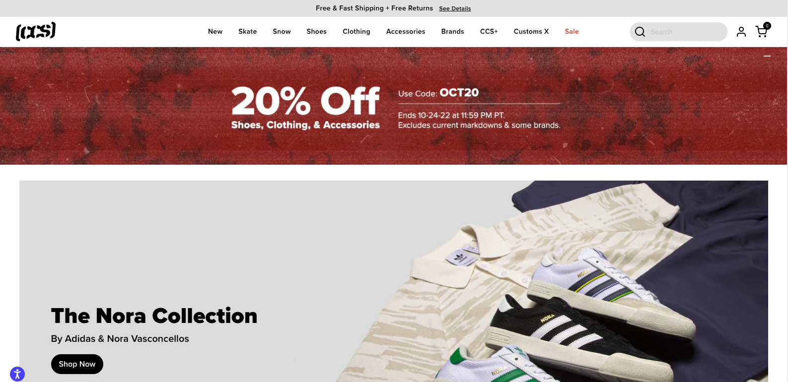
This eCommerce CTA example is unique because it doesn't directly ask the user to make a purchase. Instead, it offers a discount by using a code. However, that is not it. This CTA clearly states when the offer will end, which creates a sense of urgency.
This is a great strategy to offer a discount and using a countdown timer, CCS encourages website visitors to act fast and take advantage of the deal. This is an excellent way to increase conversions and sales.
56. Rakuten
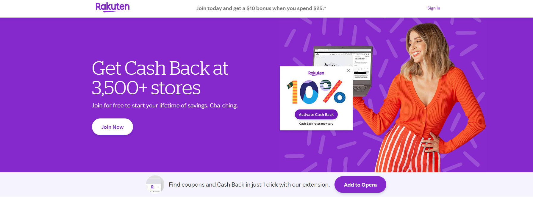
This CTA example is a bit different because it's not asking the user to make a purchase. Rakuten is a cash-back website and its CTA promotes new users to add their extension to their browser.
The reason why this works is that it's a less intrusive way to get new users. By adding the extension, users can activate the cash-back feature on supported websites with one click. And once they see how much money they're saving, they're more likely to continue using Rakuten.
57. 4Ocean
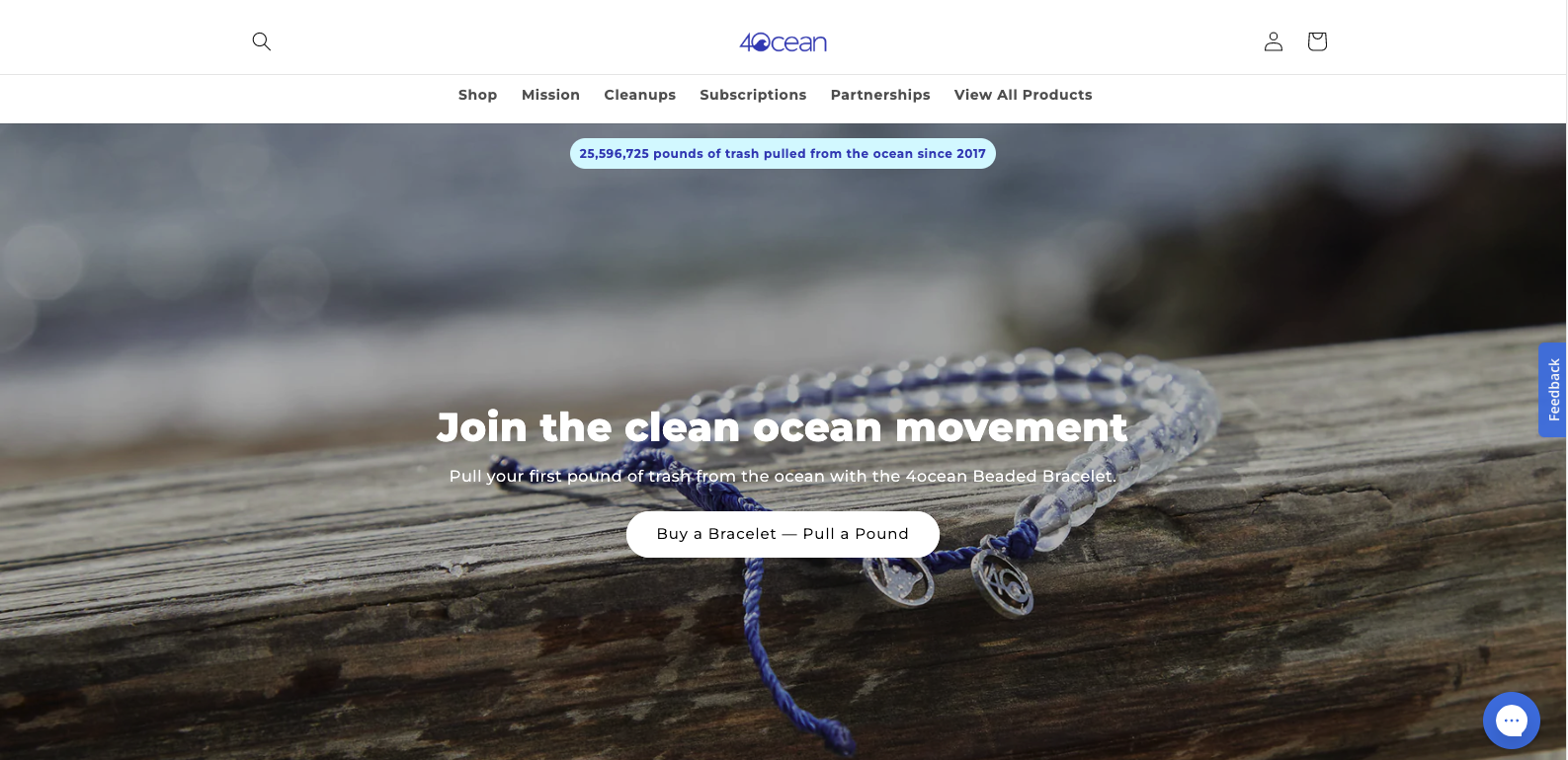
4Ocean is a company that sells bracelets made from recycled materials. With every purchase, they pledge to clean up 1 pound of trash from the ocean. They have a very strong cause and message, and their CTA reflects that.
In a similar fashion to the previous entry on the list, what makes this CTA unique is that it's not asking the user to make a purchase in the usual way. Instead, it's asking the user to commit to their cause by buying one of their bracelets.
This works due to the branding efforts behind the company. They tell you a story, a cause, and a dream. The finishing blow is the CTA which is in line with all of the other messaging.
58. Bamboo Underwear
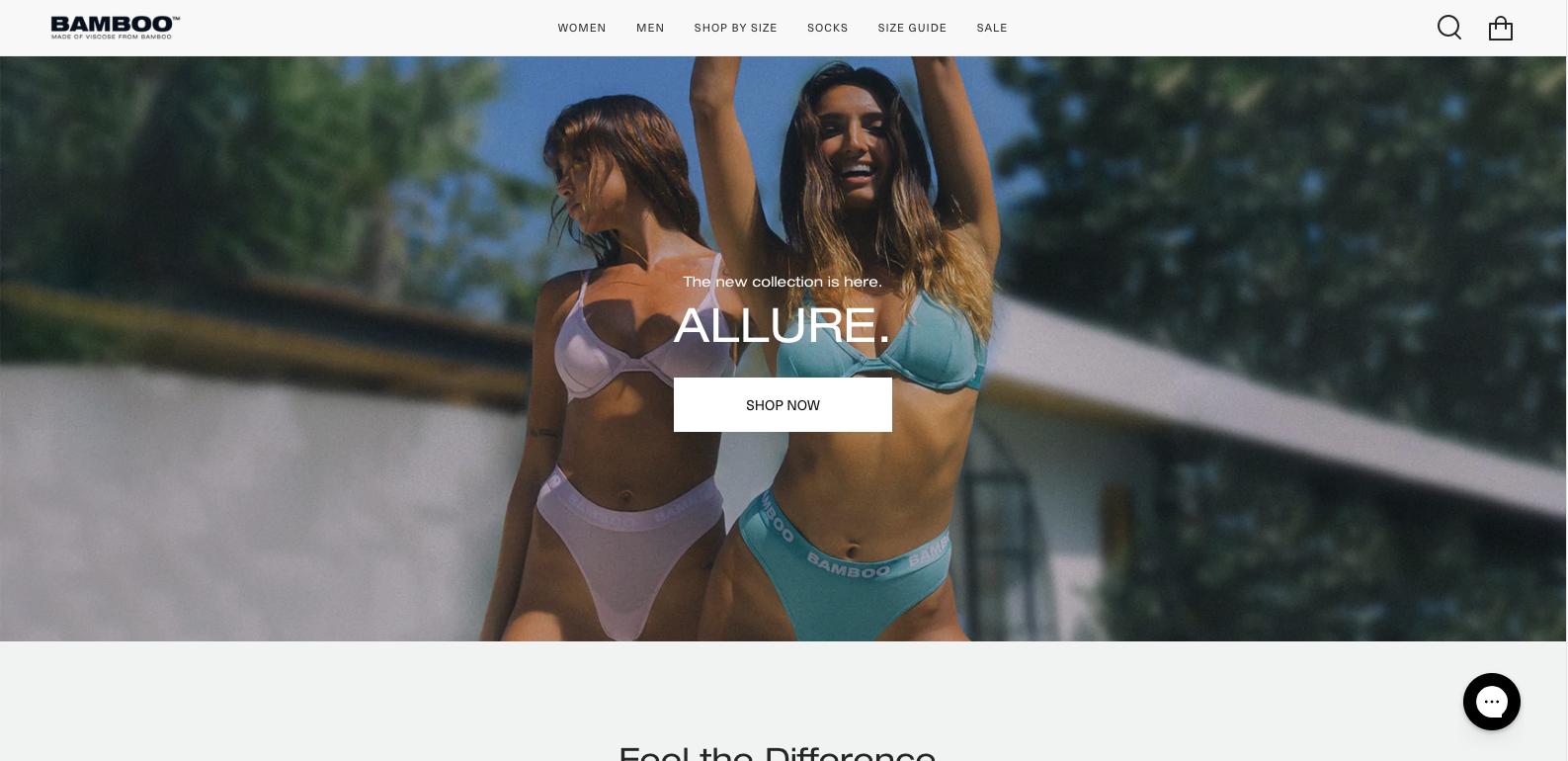
A more traditional approach than the last two entries on our list. Bamboo uses a simple button design with even simpler instructions "Shop Now". We liked this CTA example because it's straightforward but still effective. The cherry on top is the use of great product photography to entice users to browse their product catalog and complete a purchase.
We could say that the intent of this call to action is 100% transactional.
59. Rei
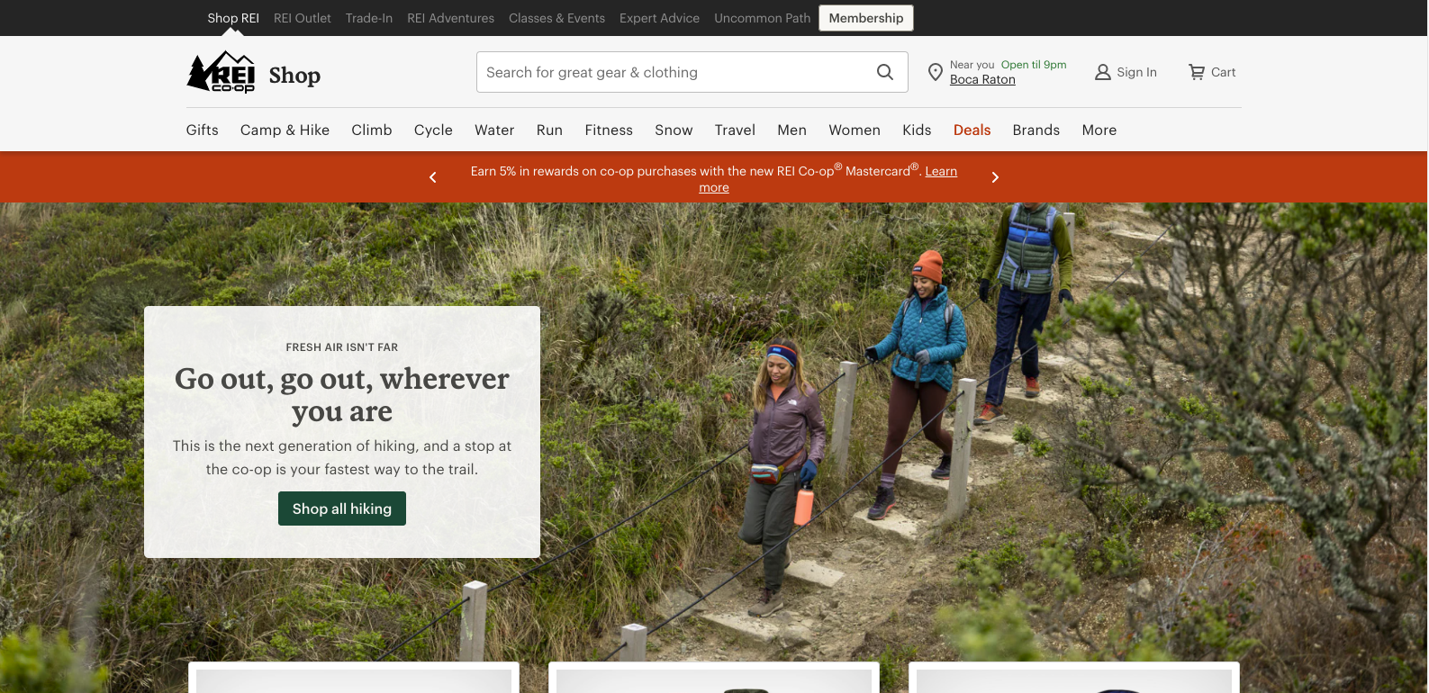
I have to say it, branded copies hit differently. This CTA by Rei is a great example of that. Instead of the generic "Add to Cart" button, they use a branded copy that says speaks to their target audience in a way that's more personal and relatable.
The result is an increase in conversion rate because the user can easily connect with the message and understand what they're getting by clicking on the button.
60. Everlane
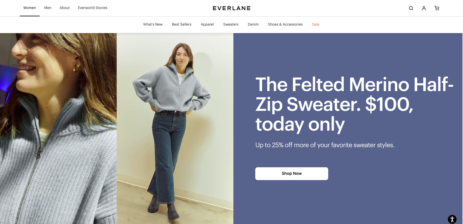
Everyone did a great job on this one. The copy is very descriptive about the product they are advertising. This is complemented by the use of great product photography. This helps the user to learn more about the product before committing to a purchase. Also, I really like the fact that they let us know the price of the sweater right from the get-go. Plain and simple, this is what we have and this is how much it costs, shop now. Definitely a great CTA example for an eCommerce where simple is always better.
Looking to give your website an edge over the competition?
Check out our web design services!
Our team will work with you
to create a website that stands out and drives results.
10 Call to Action Examples with Great Persuasive Speech
As you already know, the best call-to-action makes use of persuasive speech in their copy. This encourages readers to take action. Whether is it to buy a product, sign up for a service, or participate in an event, without proper persuasive speech, most readers will simply move on.
With that said, here are 10 call-to-action examples with great persuasive speech:
61. The Budgenista
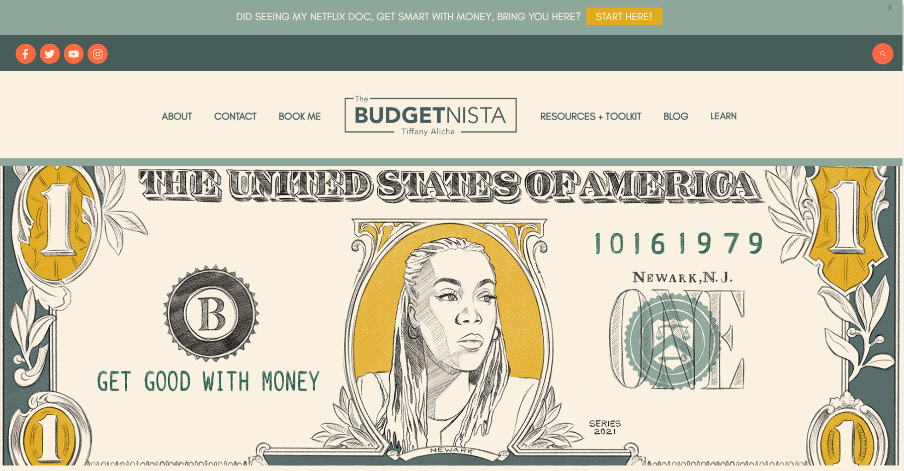
We start big with The Budgenista. This call-to-action example showcases a slim banner on the top of the website with a very persuasive speech "Saw me on Ryan and Kelly? Ready to get good with your money?" This copy is a great example of both speaking to your audience and proper use of persuasive speech.
This works because The Budgenista is alluding to being a guest on Ryan and Kelly's talk show as an endorsement of their service. And they're using a persuasive speech by directly addressing the reader, telling them that it's time to get good with their money.
If you're looking to learn more about how to structure a highly converting home page, we have a great article for you.
Click here to learn.
62. Glossier
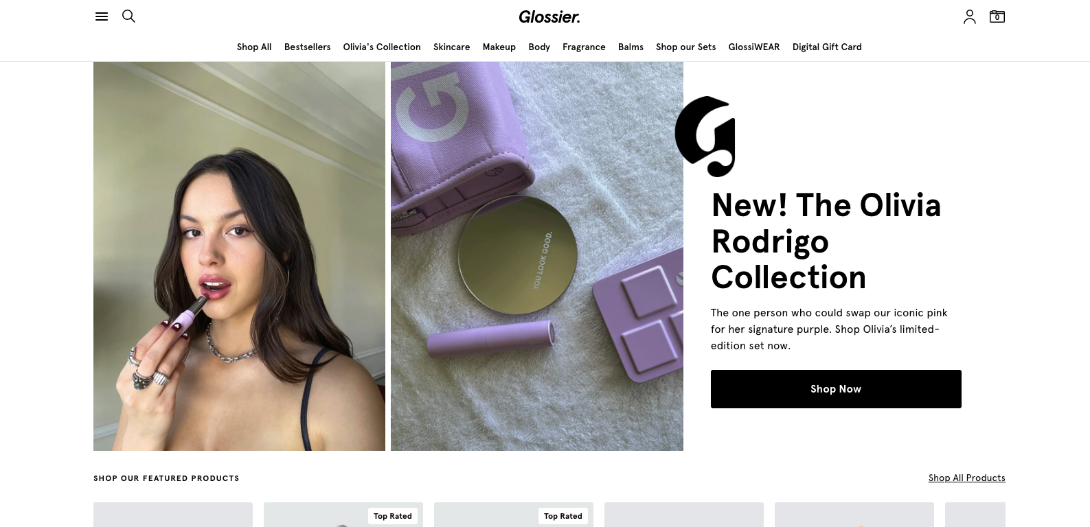
It is hard to think of a more persuasive speech example on a call-to-action than Glossier's new website header that features no other than Olivia Rodrigo.
This is a fantastic example of a persuasive speech because everyone wants to be like their favorite celebrities. And by using Olivia Rodrigo, who is having one of the biggest breakout moments of her career, Glossier is able to tap into that. This encourages people to buy their products so they can feel just as confident as Olivia.
63. Heyday
This one is pretty straightforward. This call-to-action example from Heyday uses persuasive speech by giving people a clear benefit of using their service.
Definitely, "Get a personalized skincare routine in minutes" is something that anyone who is looking for help with their skincare routine would want. And by using persuasive speech, Heyday is able to exploit the need for fast and personalized services and encourage people to use them.
64. Treehouse

Let us take a moment to fully analyze everything here.
To the left, we see a very persuasive call-to-action speech. It clearly states what you will get if enrolling for this free trial. To the left, we see a list of detailed information that expands on the benefits of the free trial. And finally, we see a strong CTA button that encourages people to sign up.
This works so well because it uses persuasive speech throughout the entire copy and makes sure that people know exactly what they will get if they sign up for the free trial. This way, there are no surprises and people are more likely to convert.
65. OK Cupid
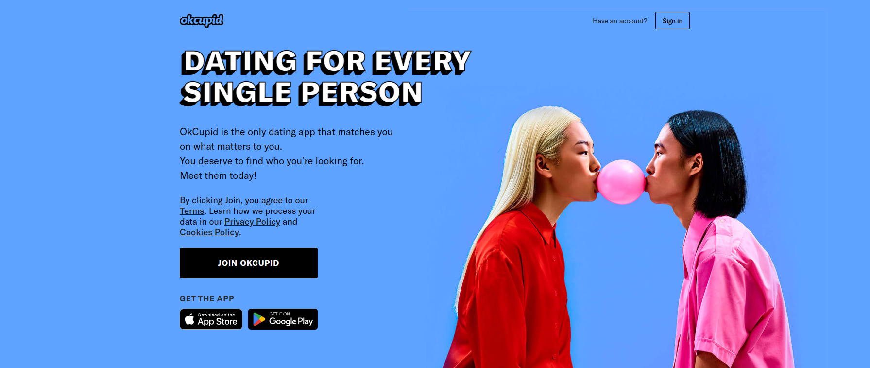
A great way to use a persuasive speech in your CTA copy is by appealing to your audience’s needs. That is exactly what this CTA example is all about.
OK Cupid knows that their audience is looking for love and they are using persuasive speech to encourage them to sign up for their service. They are also using a fantastic CTA button that says "Find Your Person" which further encourages people to sign up.
66. Uber
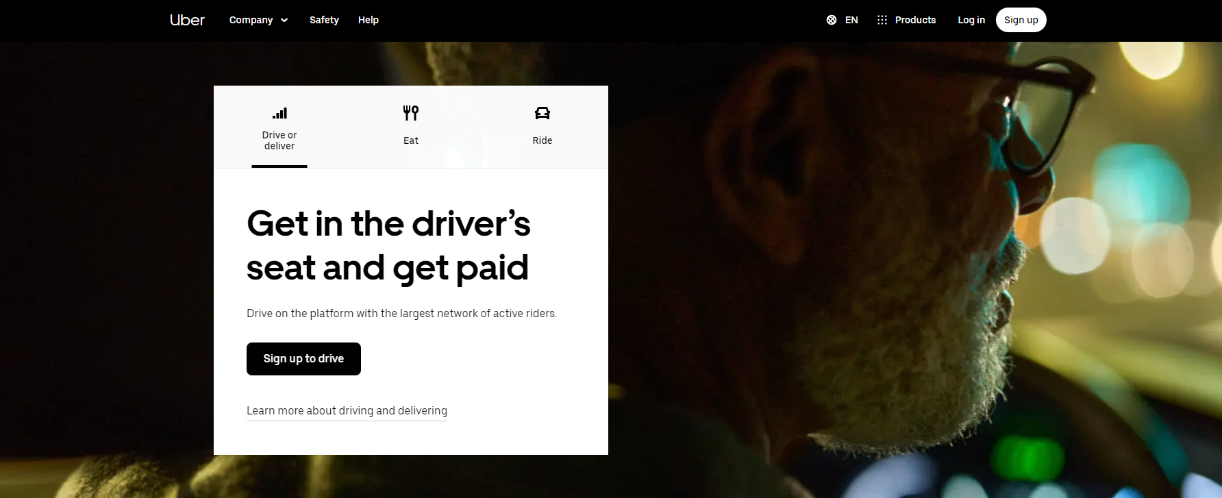
Following the same line of thought as our previous entry, Uber is another great example of how to use a persuasive speech in your CTA copy.
They are appealing to their audience's needs (Get More Money) by offering an easy alternative to fulfill those needs. They are also using a very effective CTA button that says "Sign Up to Drive" which encourages people to take action.
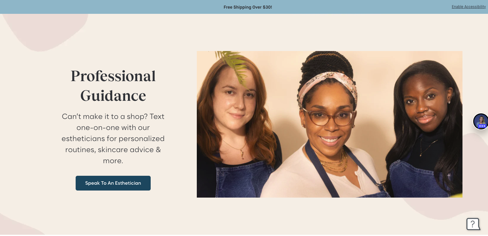
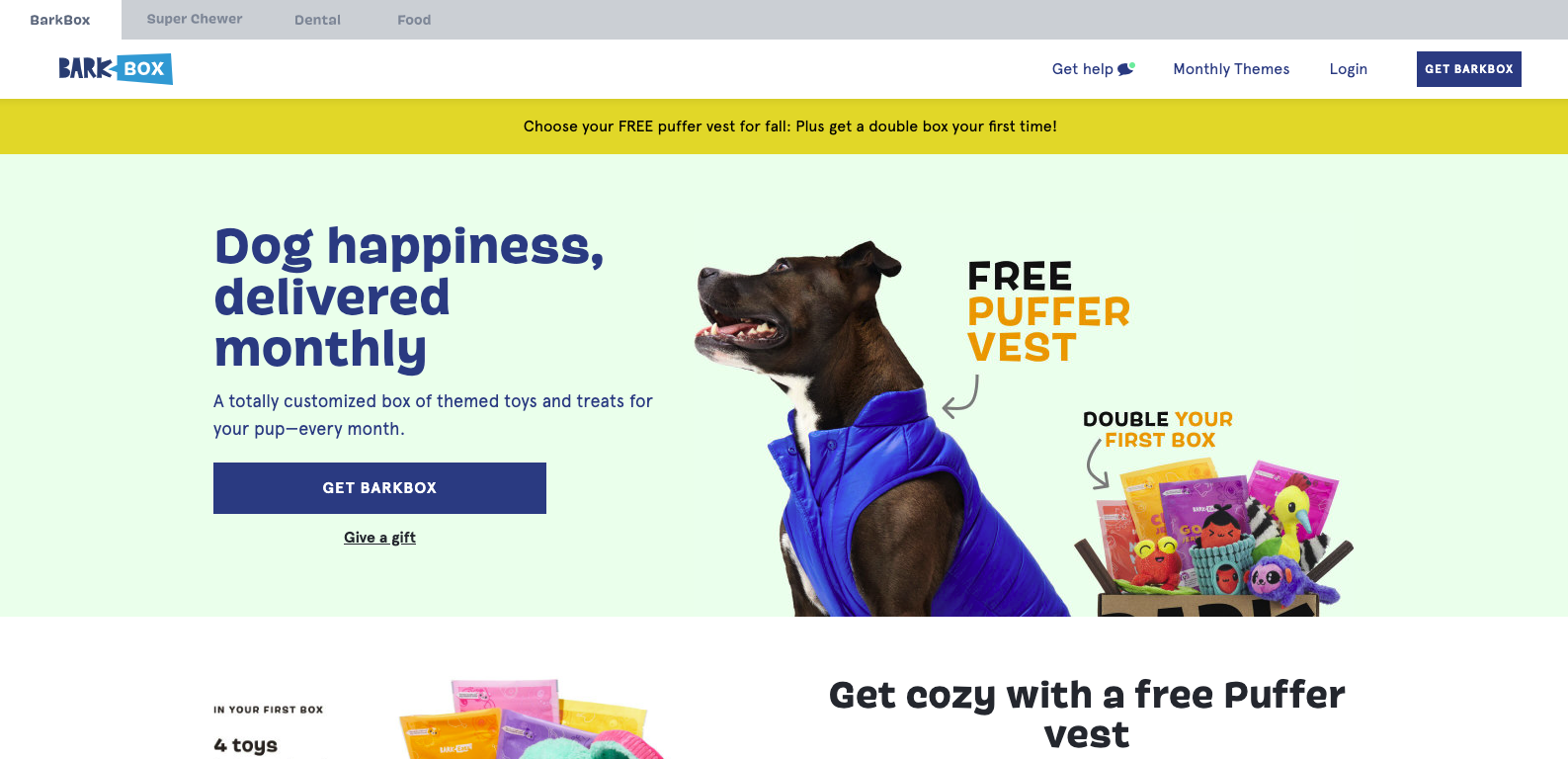
67. Bark Box
Fur babies are the soft spot for many Millennials and other generations alike. Therefore, it is a clever marketing move to appeal to the happiness of their audience's dogs. This is exactly what Bark box is doing in this call-to-action example with a very persuasive speech.
68. Charity Water
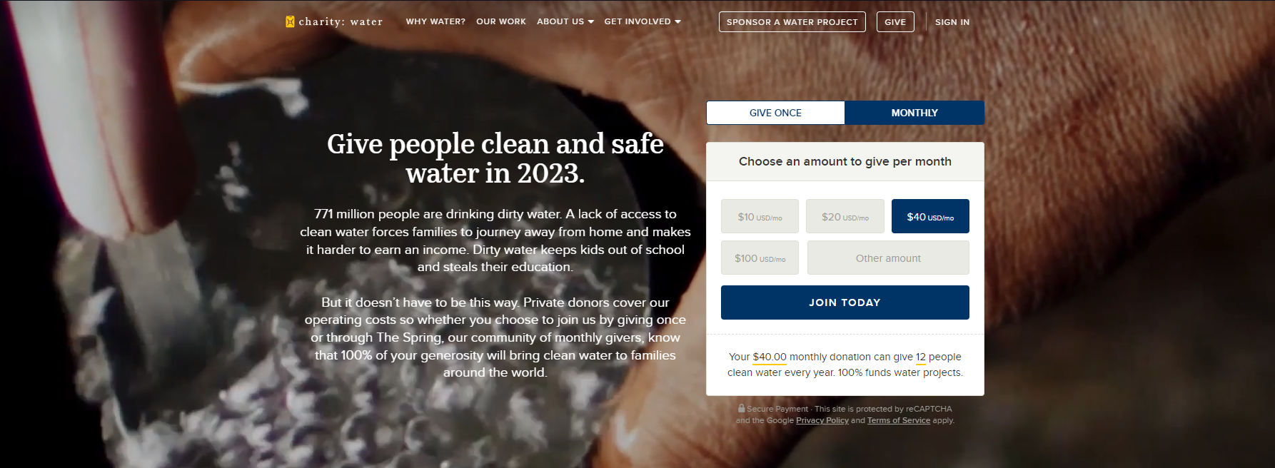
Persuasive speech is always a great way to generate sales for eCommerce and websites alike. However, for non-profits, it is especially useful. One can say it is almost a requirement for a CTA to be effective on a non-profit website. The reason is simple, in order to get donations, you need the audience to connect with your cause, not a brand. This is what Charity Water does better than the rest in their hero CTA.
69. TeuxDeux

Besides talking directly to their audiences ' needs with a persuasive speech, this CTA example does an amazing job of showing exactly what the user will get with a mock-up of their app's interface. We can deconstruct this example into 3 simple parts:
- Great persuasive speech copy
- Great use of product graphic pieces (this is as persuasive as the copy)
- The CTA button helps to increase app downloads.
70. Nintendo
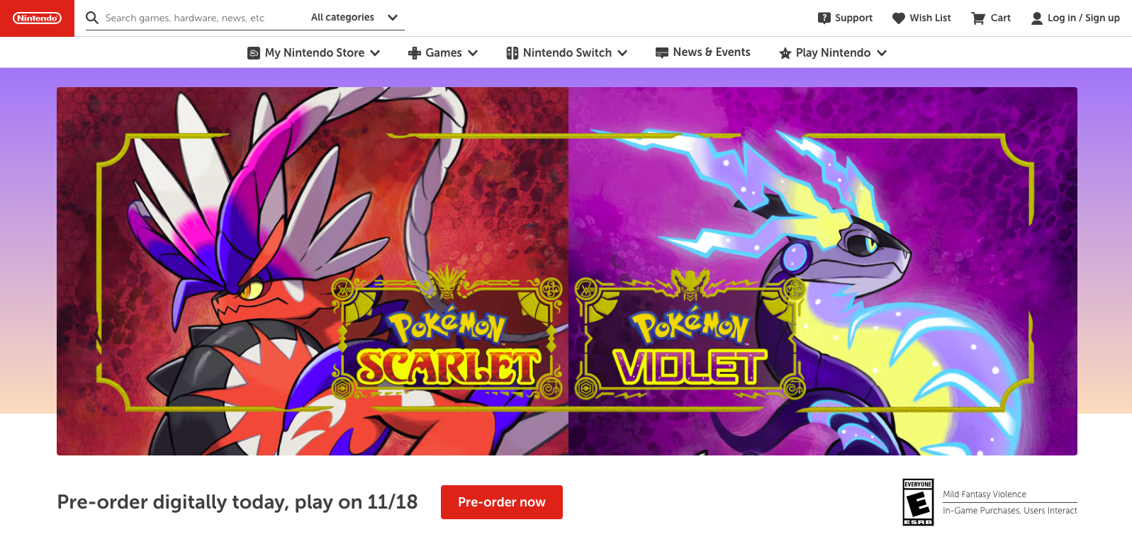
Creating a sense of urgency will always be one of the greatest conversion rate optimization strategies. That is what Nintendo does in this example with their "pre-order now and play first" call to action.
This creates a sense of urgency for their product, which in this particular niche is key. Every professional gaming YouTube channel will be downloading this ASAP in order to play and review the game as soon as possible, which leads to more sales for Nintendo
There you go, we have looked at some great examples of effective call-to-action on many categories including the ones that use a persuasive speech approach in their copy. We hope you will make use of this great CTA example list to enhance your website's conversions.
Keep in mind what your audience wants and needs, then appeal to those desires with a strong CTA button and persuasive speech. With a little effort, you can see a significant increase in your conversion rate in no time!